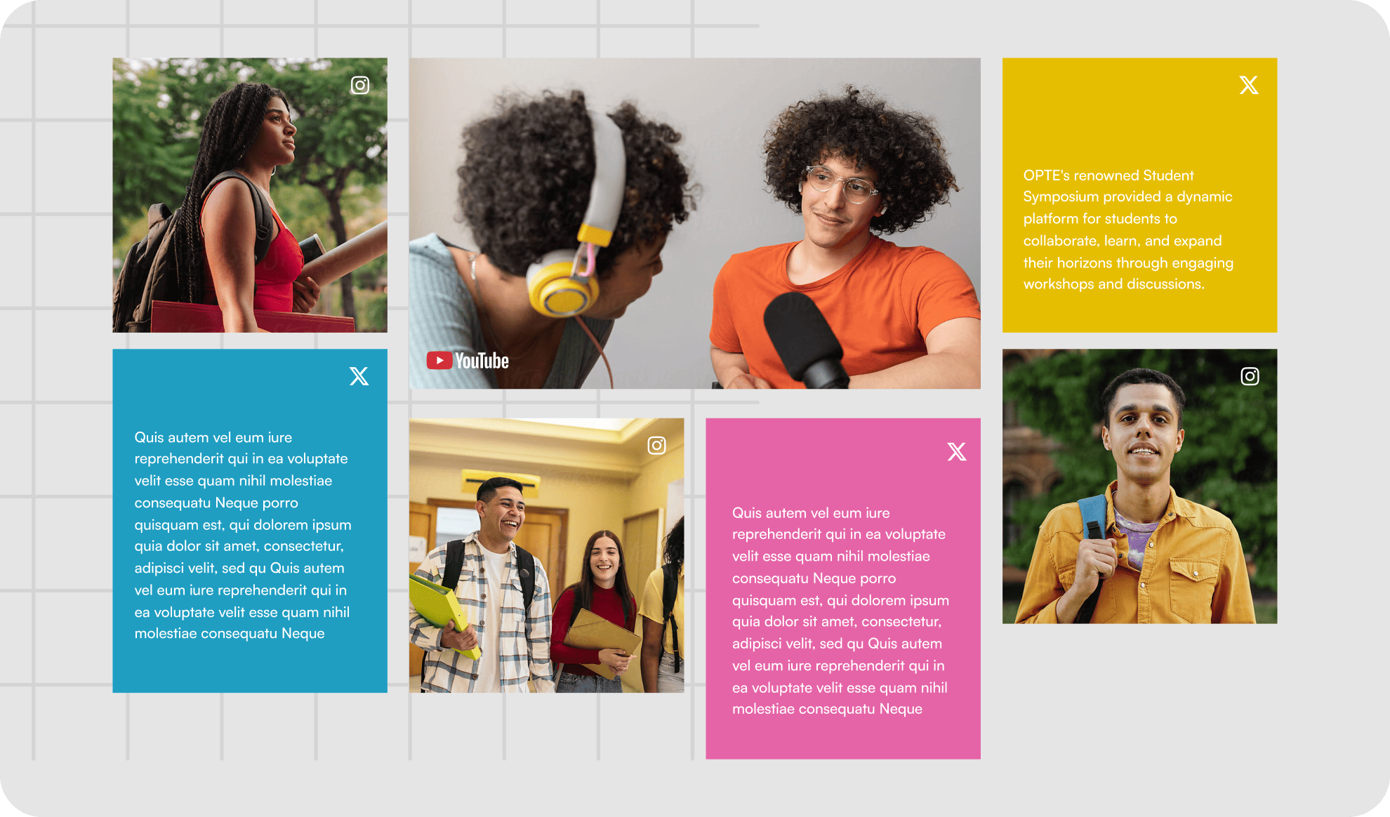
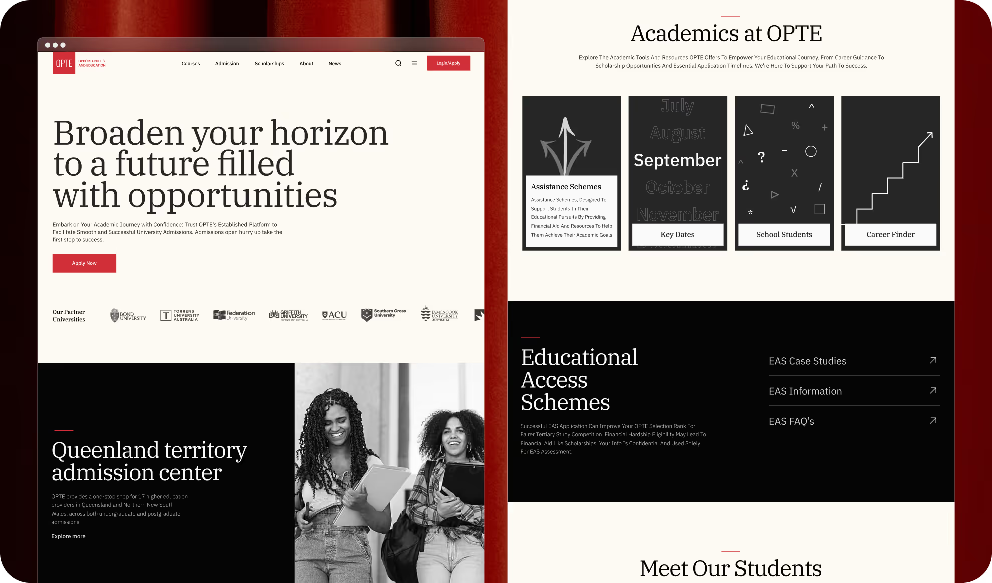
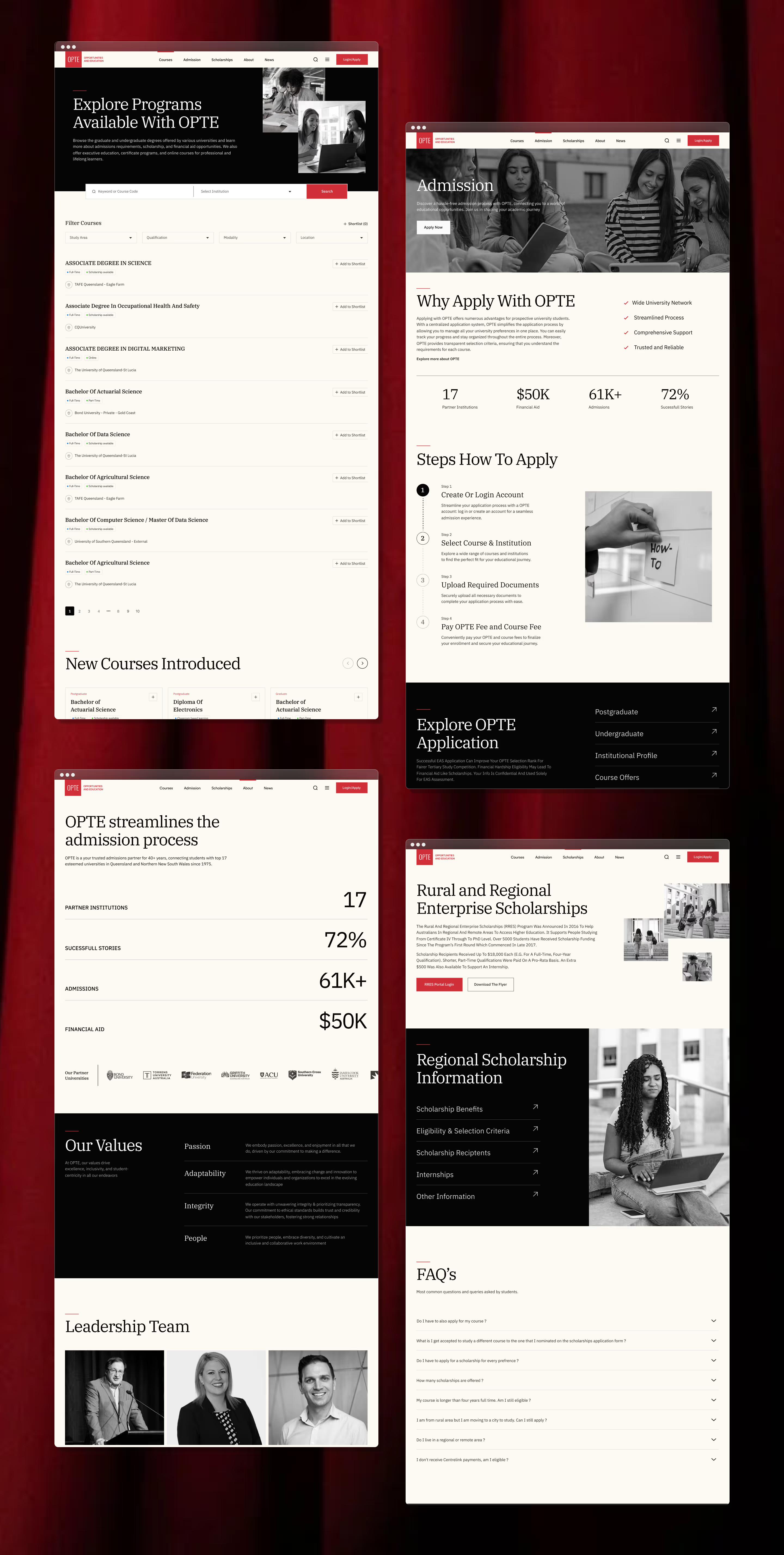
OPTE streamlines the admissions process for 17 higher education providers in Queensland and Northern New South Wales. This project focuses on creating a user-friendly website to help students easily explore programs and submit applications, enhancing accessibility and engagement.
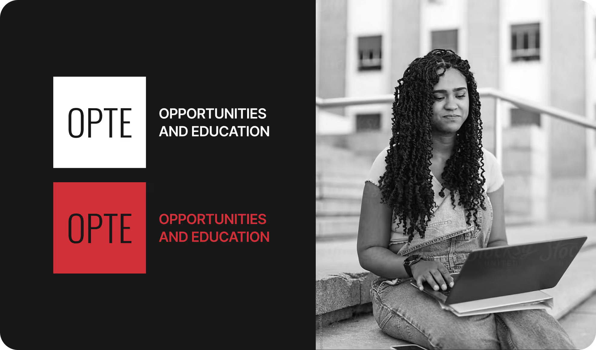
OPTE is an admissions portal for 17 higher education providers in Queensland and Northern New South Wales, helping prospective students apply for undergraduate and postgraduate courses. The aim is to improve the user journey and accessibility.
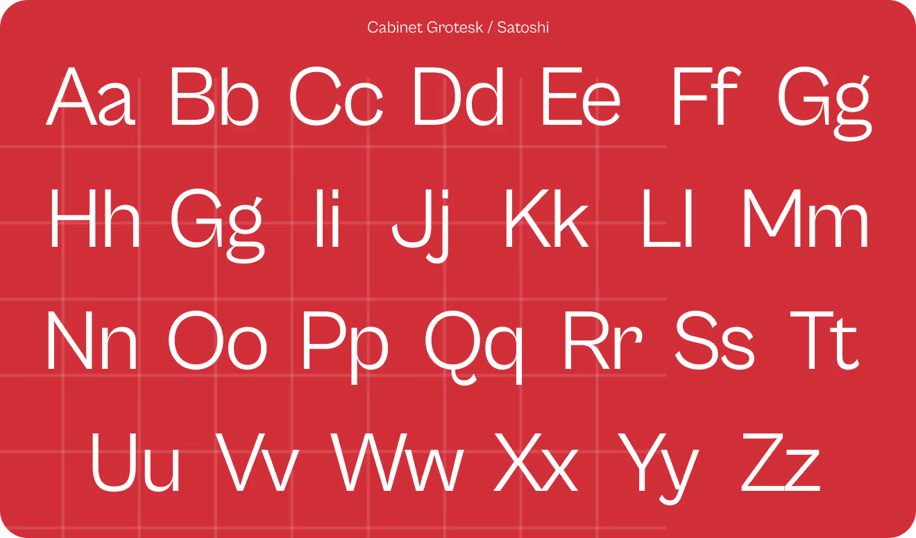
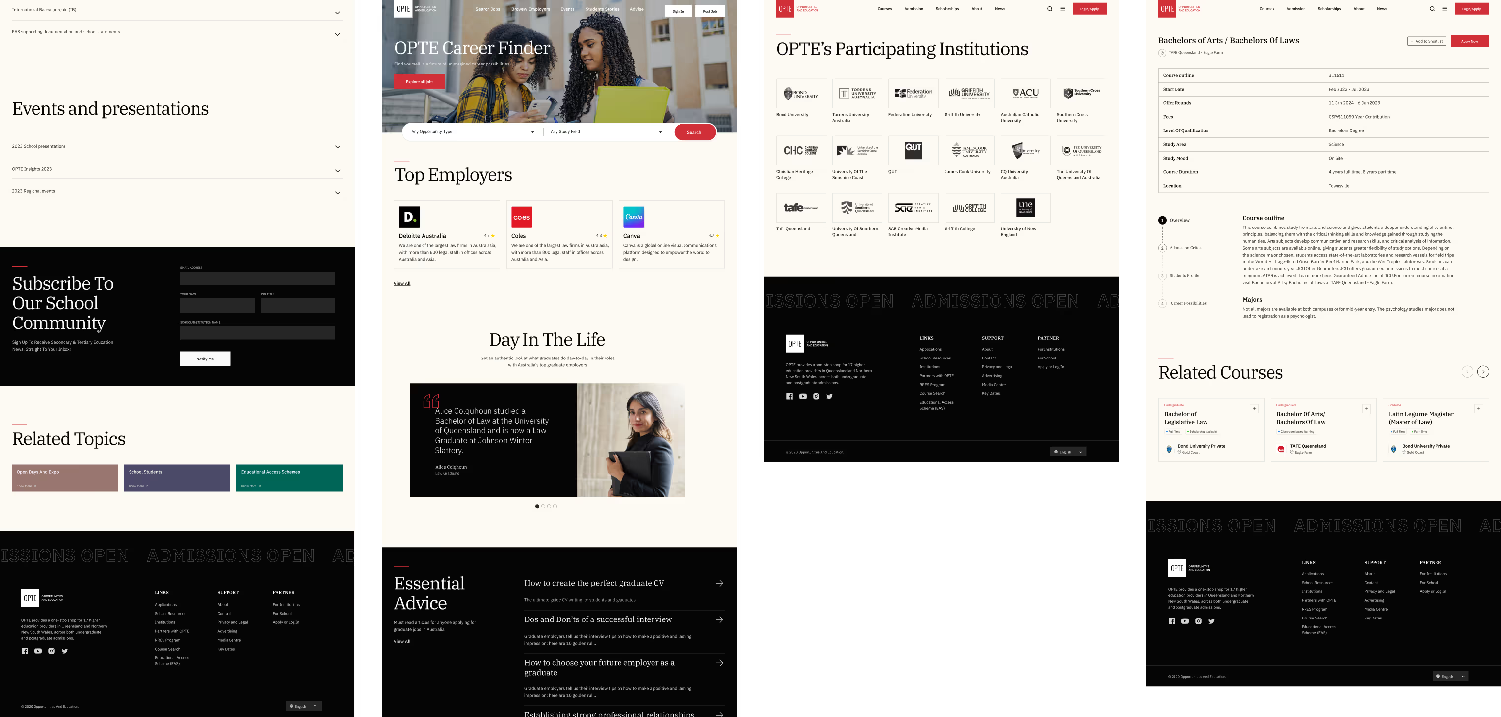
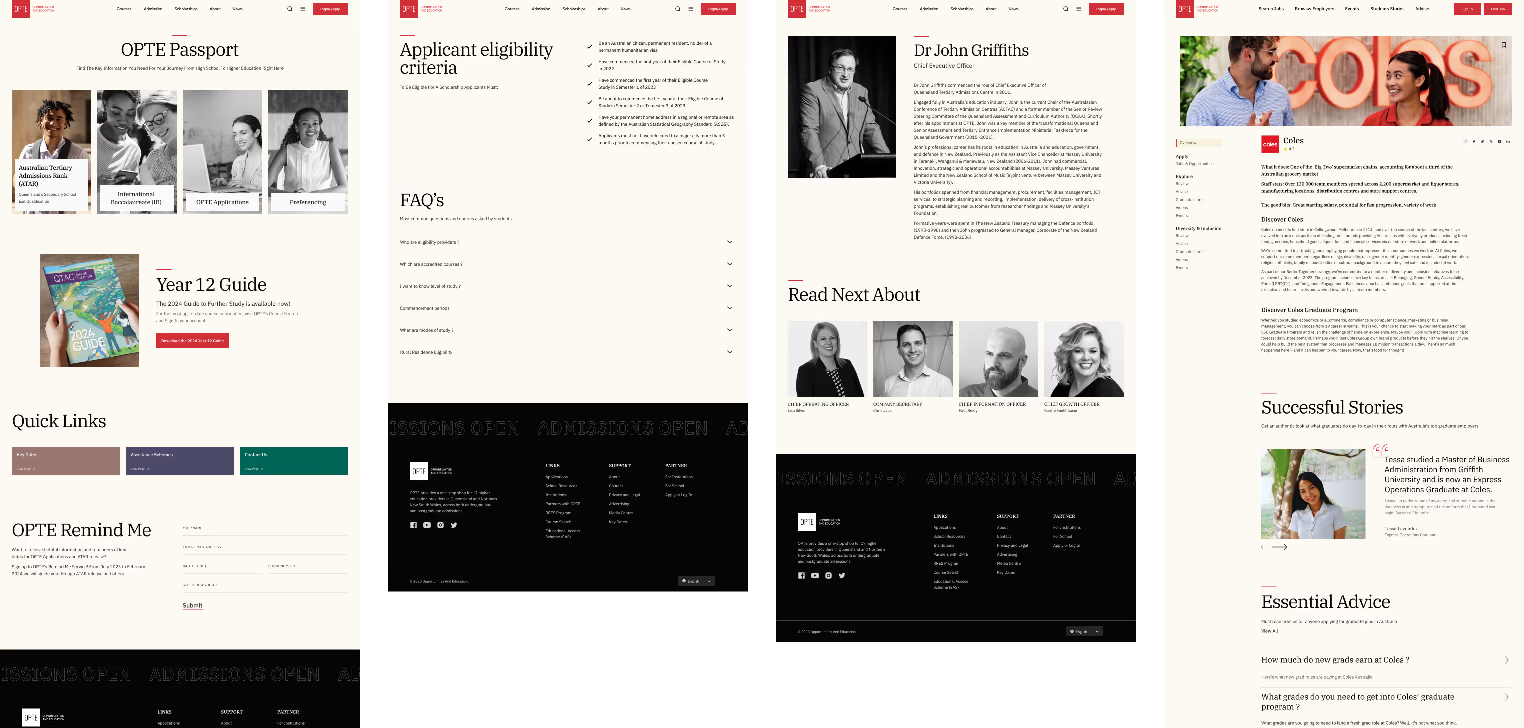
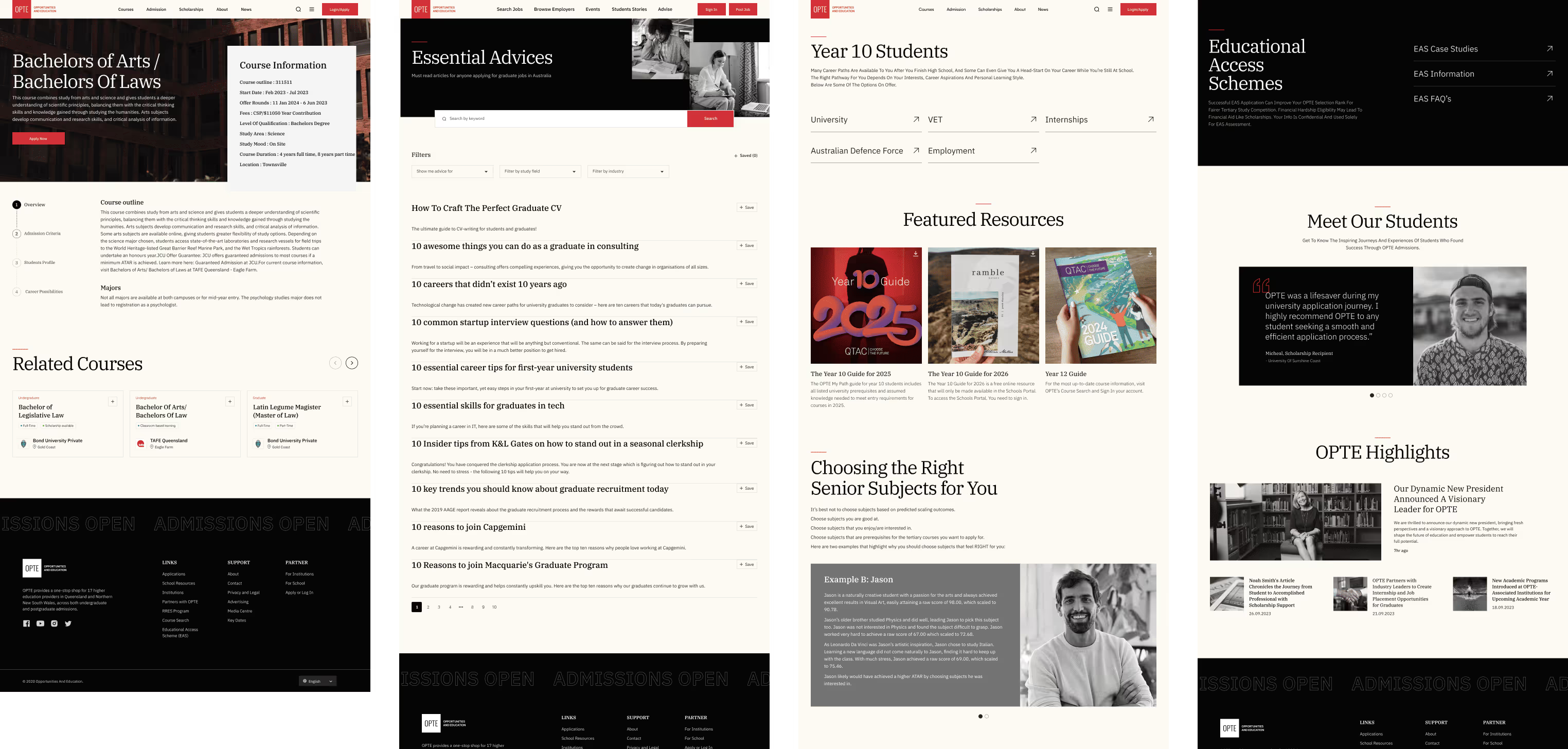
With features like simplified navigation, responsive design, and a clean, modern layout, the website offers an easy and efficient way for prospective students to navigate the admissions process. Each design element is crafted to ensure a smooth user experience, making the application journey clearer and more accessible.
Structuring things the right way
In the wireframe phase, we focused on simplifying the layout and organizing key sections. This clear structure helped users easily navigate the design and find what they needed, making the entire process smooth and straightforward.
EXPLORING MOOD BOARDS
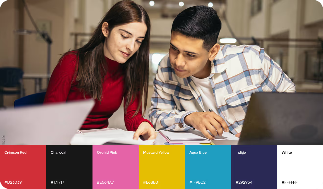
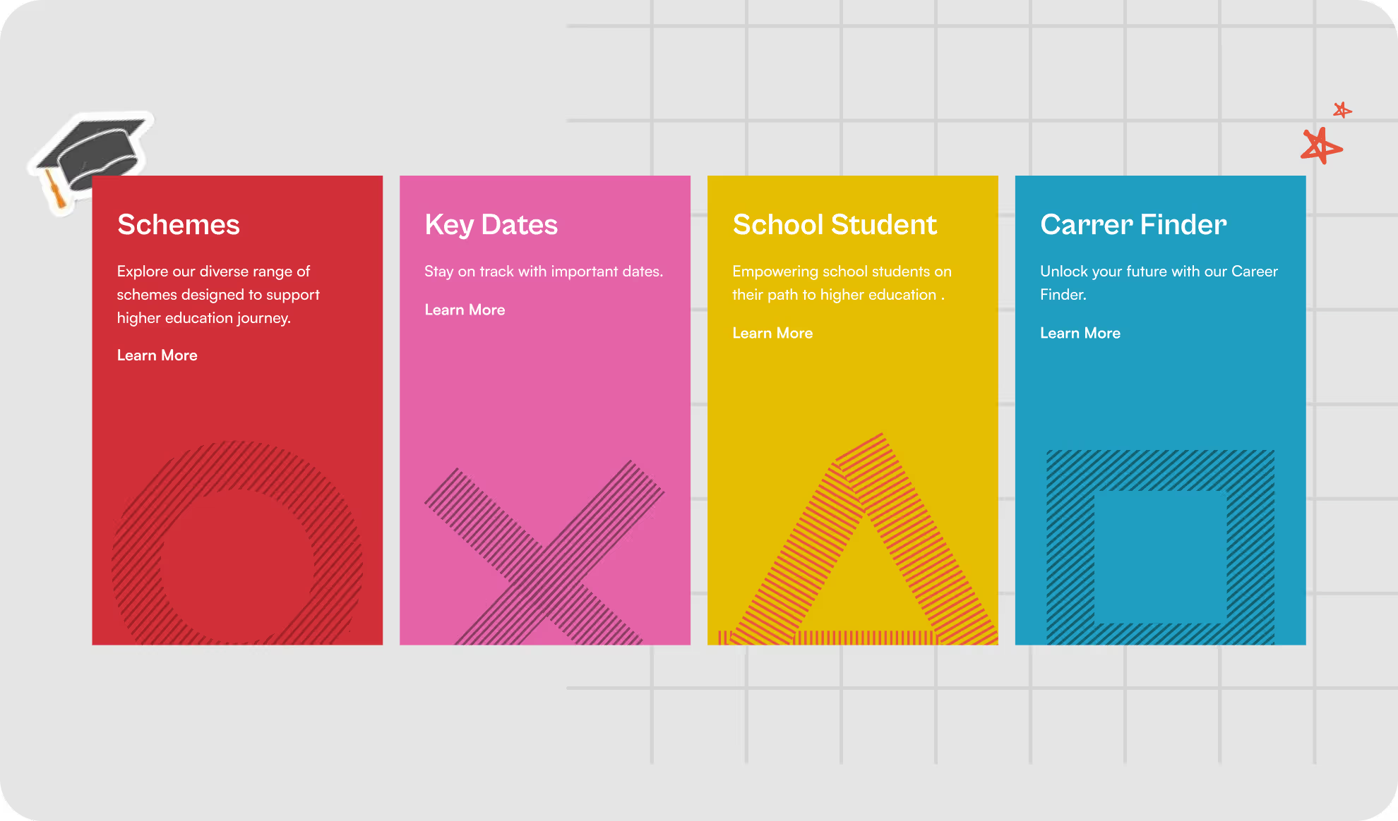
After wire framing, started exploring different styles, the first moodboard that popped was The Play-full style one with a triangle of colors, flair, stickers and shapes.
Typography driven mood-board Takes the Lead
This moodboard focused on creating a more polished, professional look for OPTE. The typography added a serious tone, bringing a modern, classy vibe that appeals to a more refined audience. It balanced sophistication with approachability, giving the website a sleek feel.
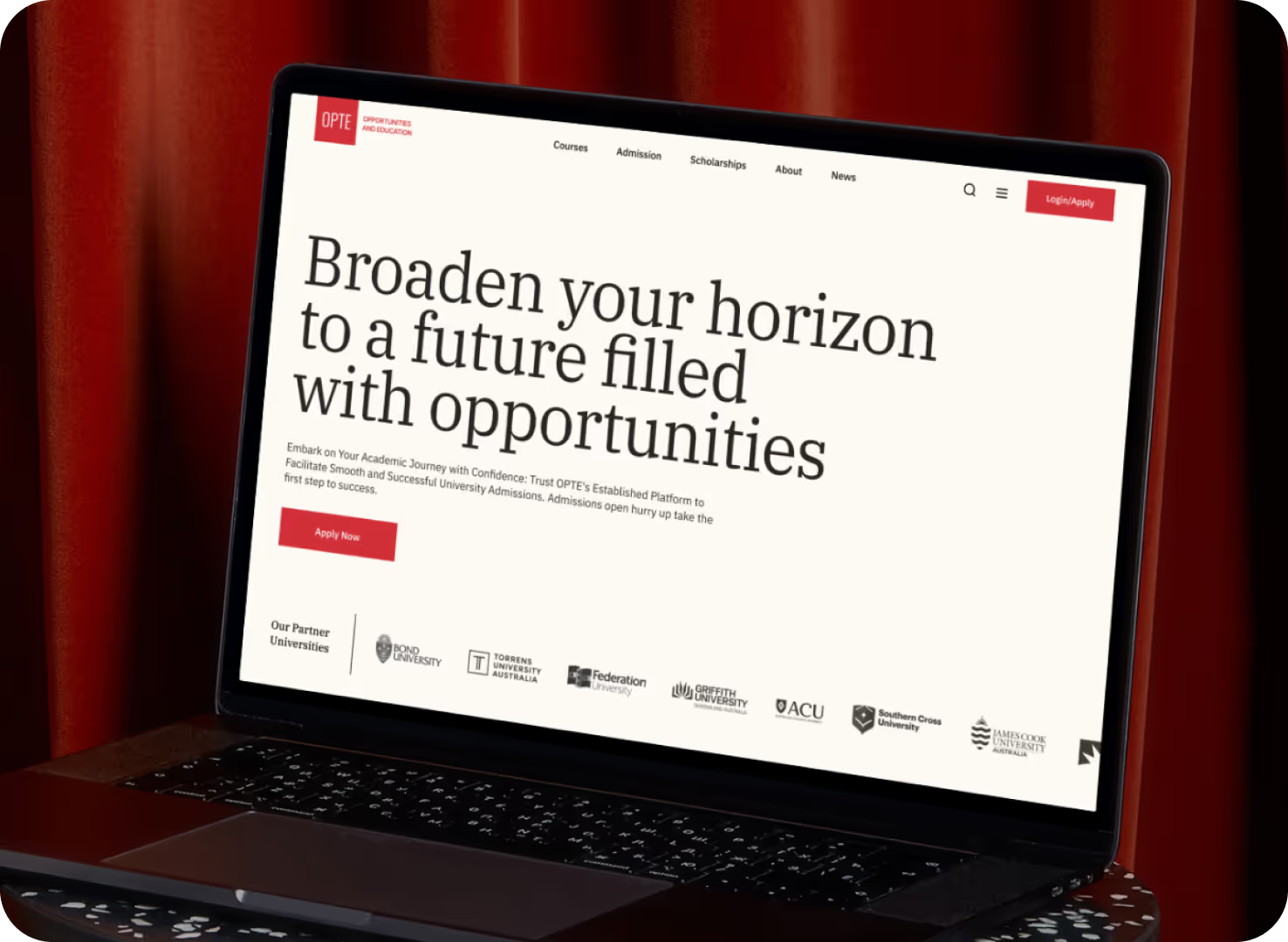
First impression matters
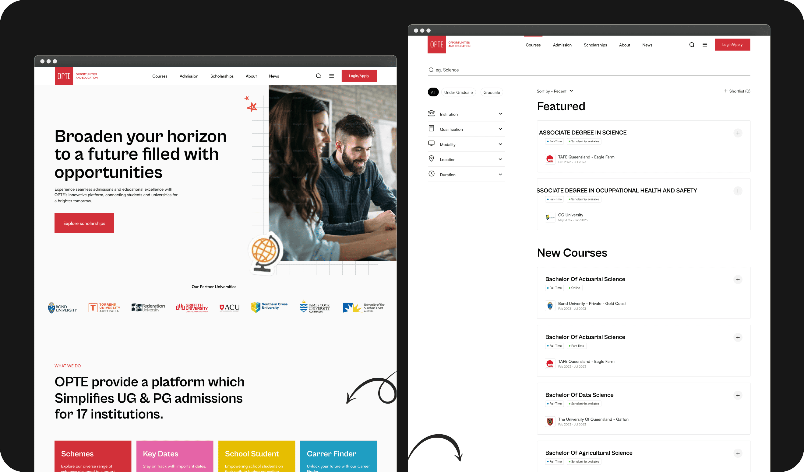
The homepage needed to make a great first impression, so I used the typography moodboard to keep things simple, modern, and welcoming, setting the tone for the entire site.
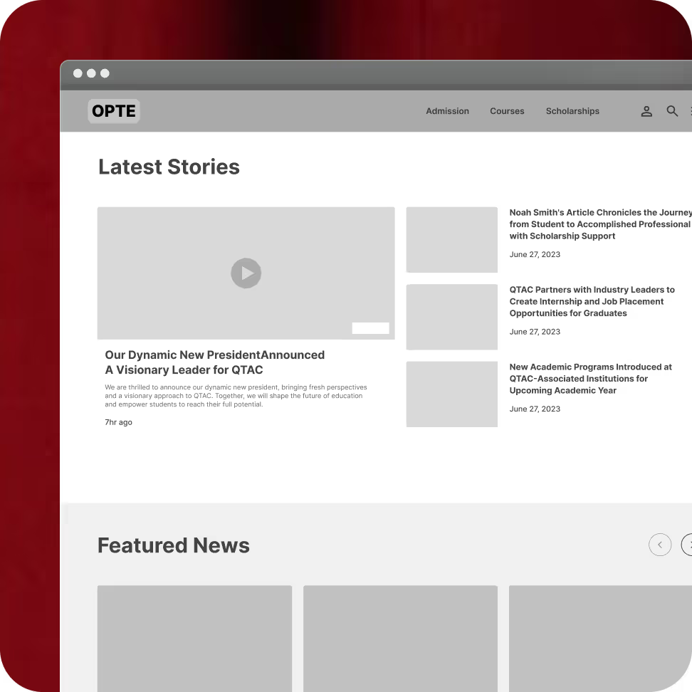
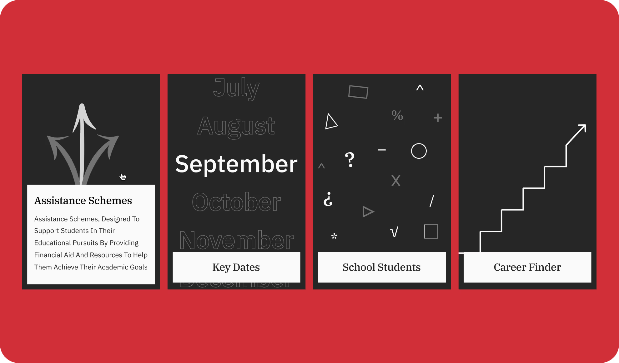
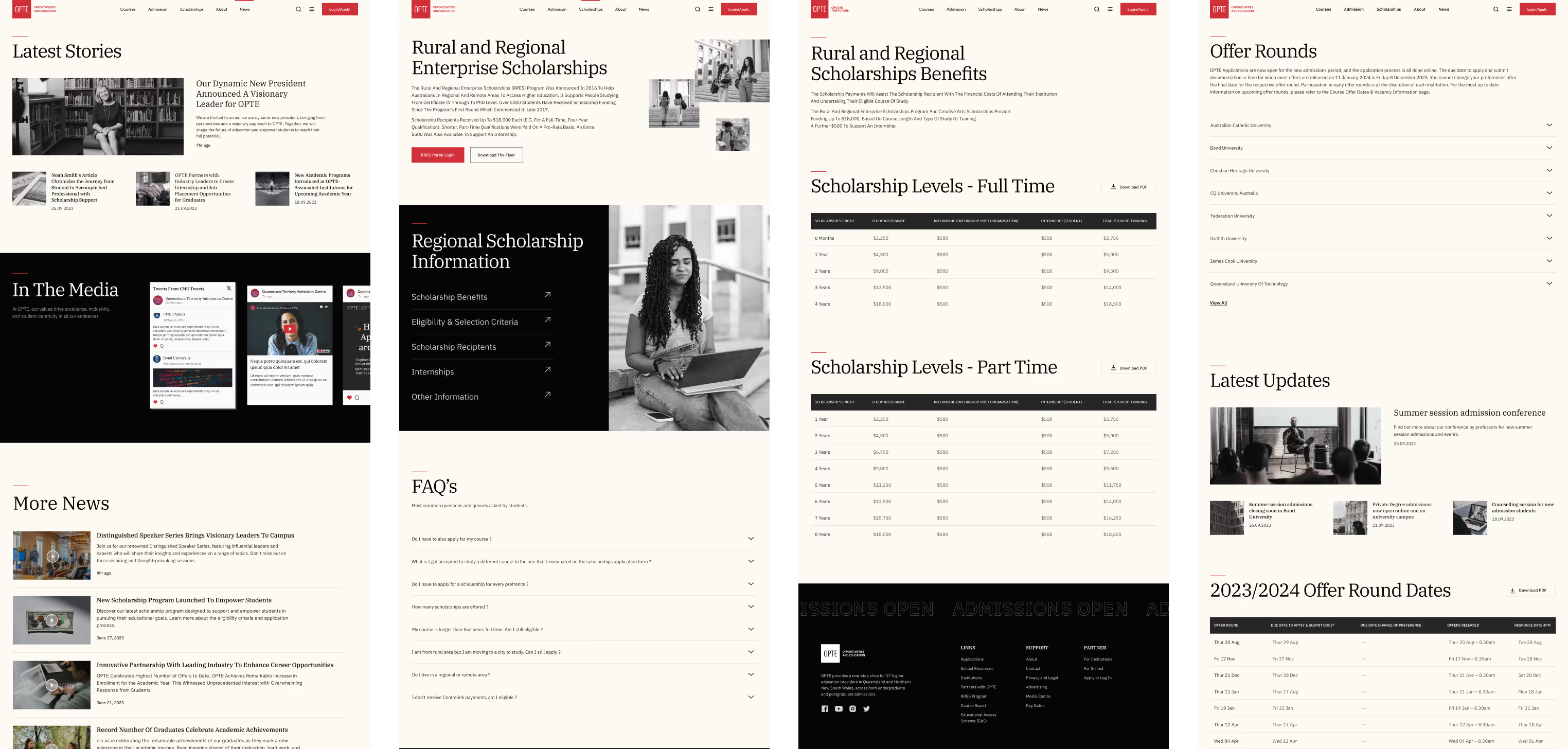
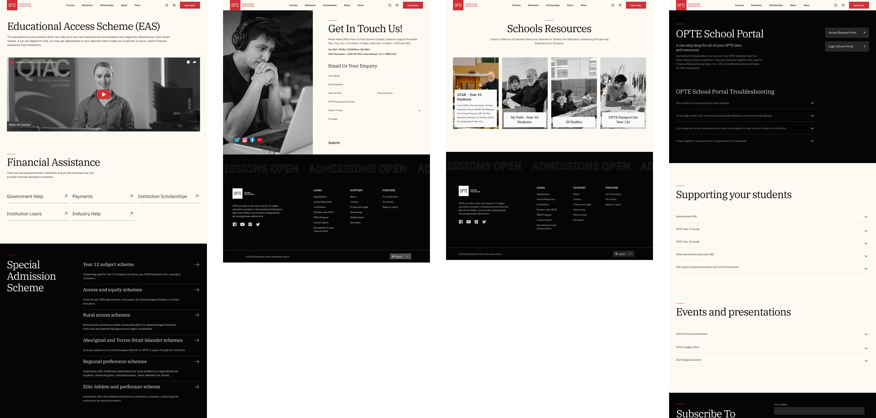
See More in Action pages
I kept the design very simple, easy to understand and user-friendly, ensuring each page was easy to navigate and provided a smooth, hassle-free experience.
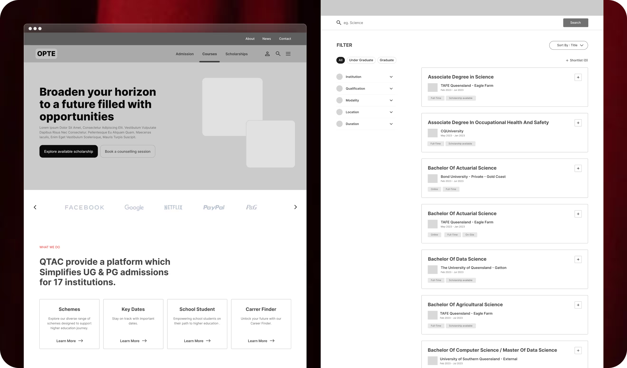
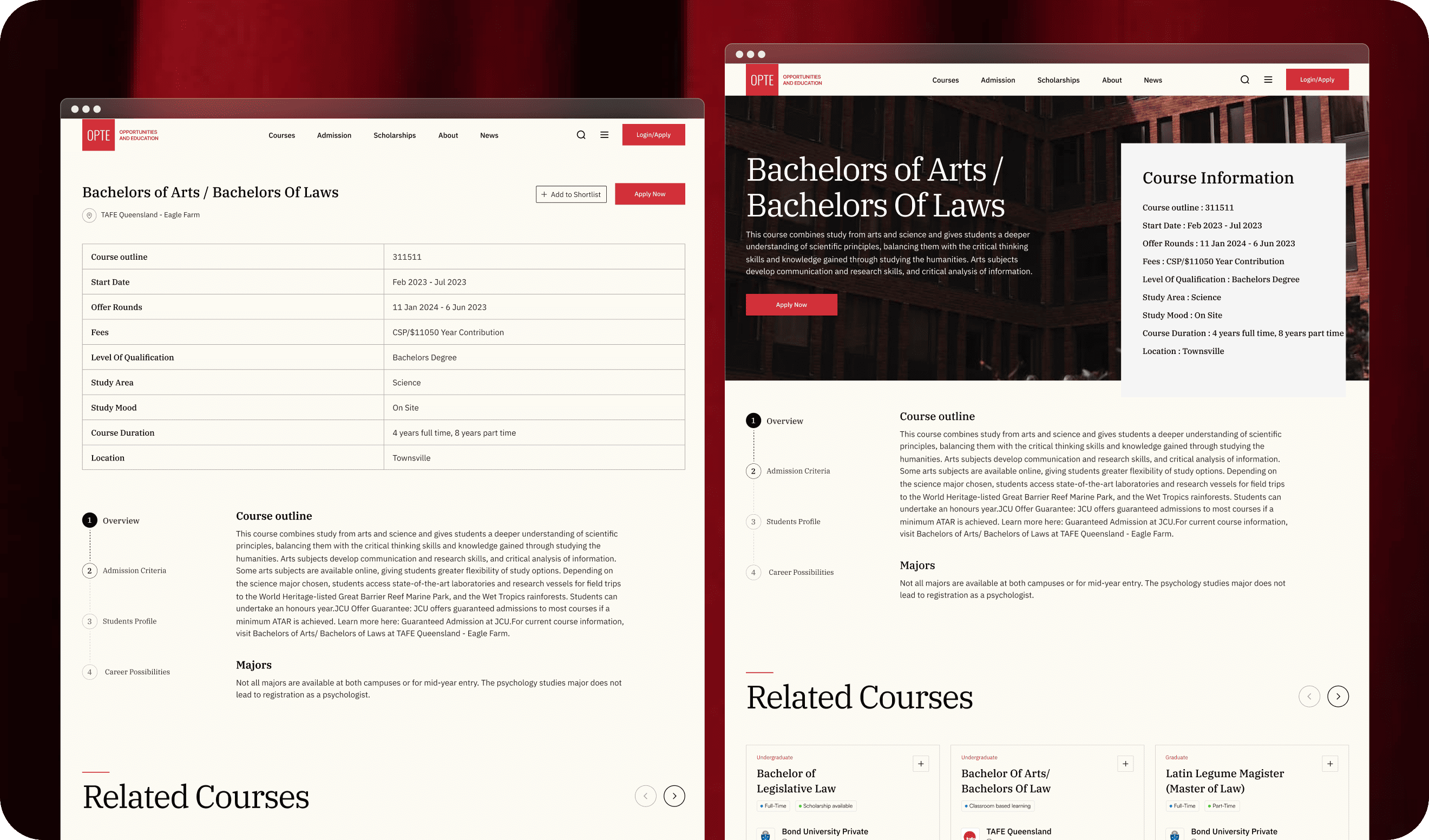
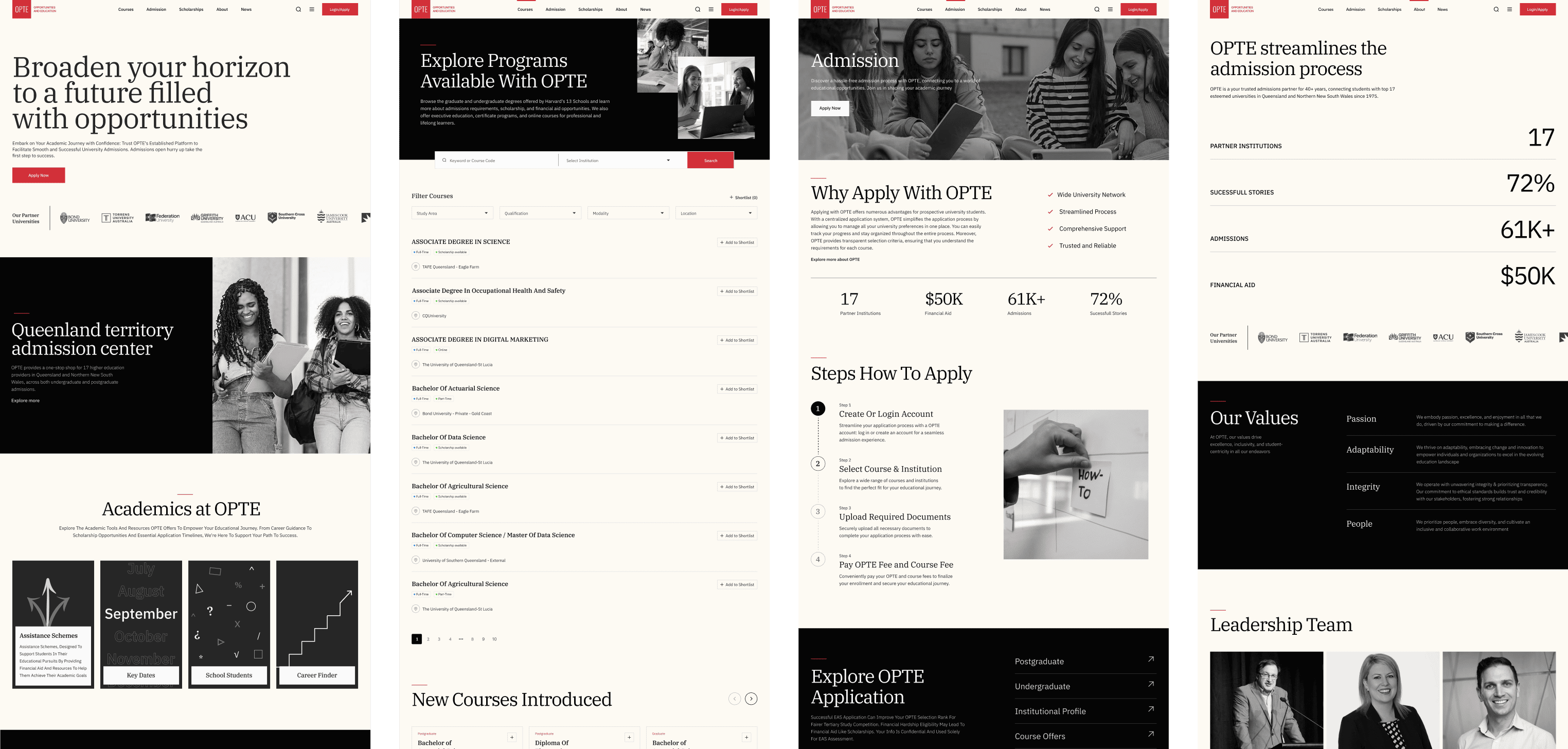
Transforming Complexity and bulk into Clear Navigation
The pages transforms bulk and complex course information into a clean, easy-to-navigate layout. With a focus on both UI and UX, every detail is presented in a clear, intuitive way making effortless for users to explore.
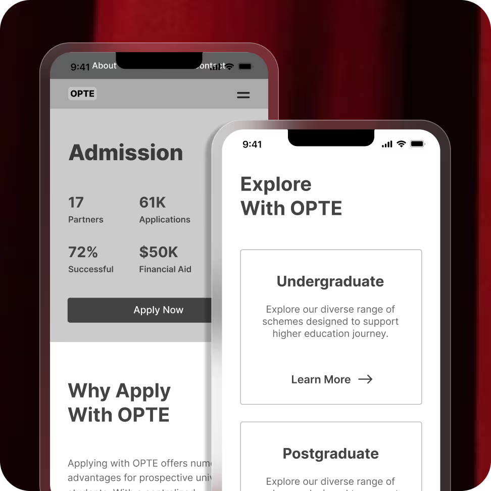
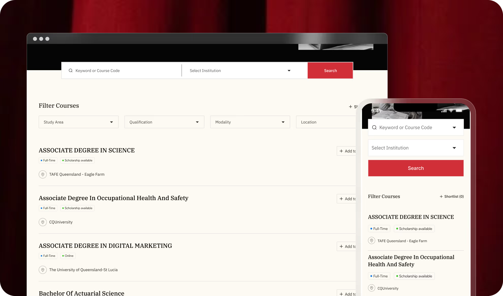
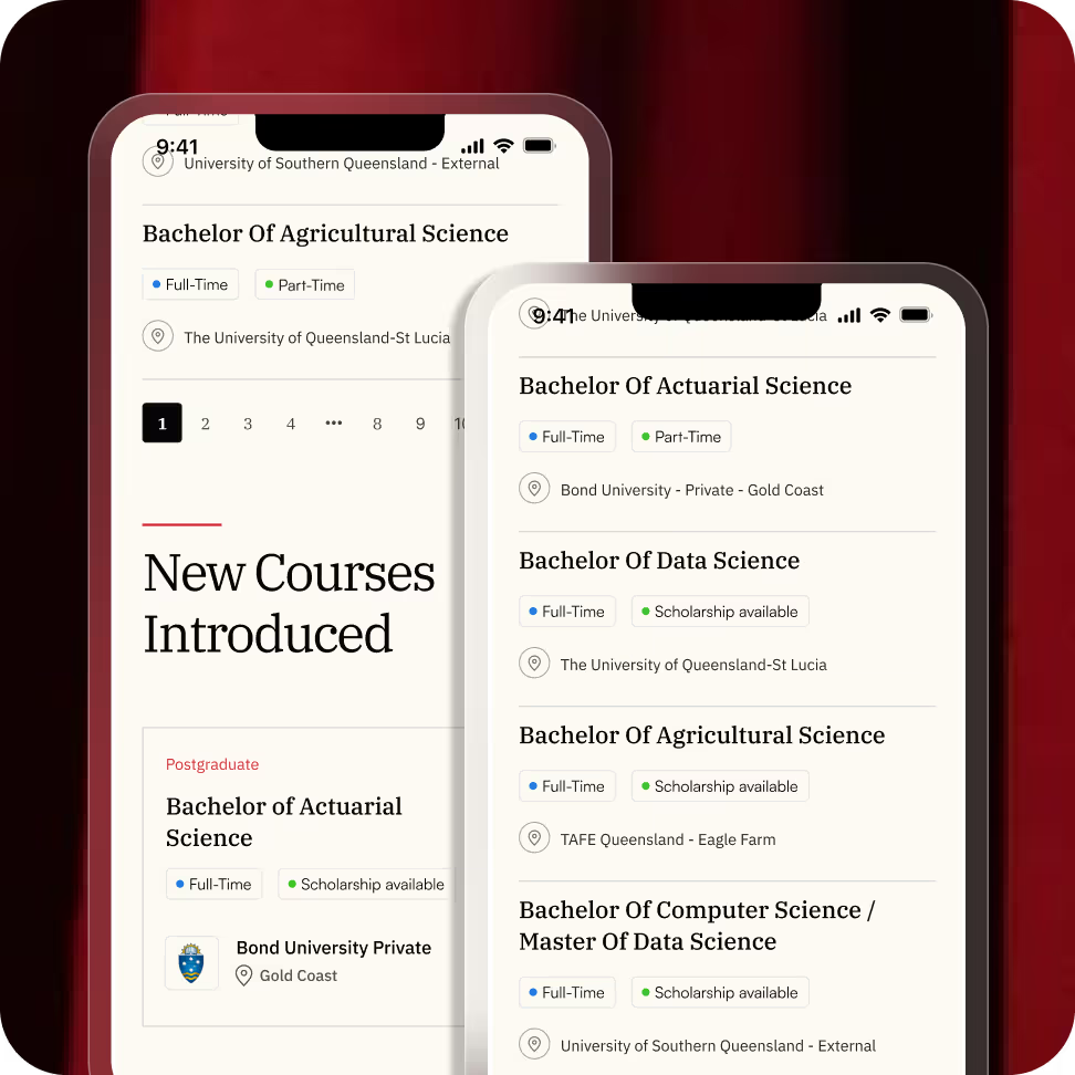
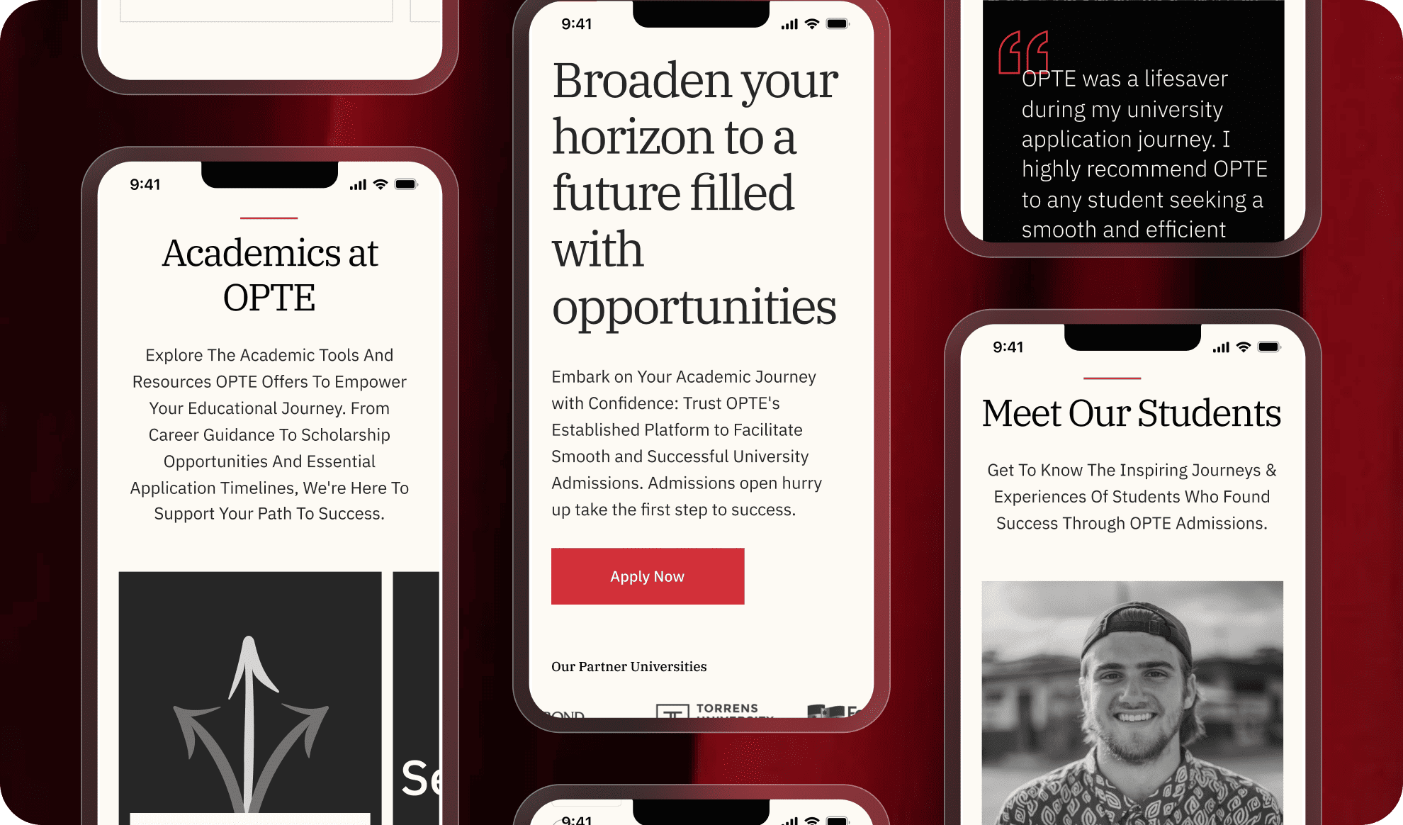
Immersion smoothly on mobile phones too
The design is optimized for mobile too, ensuring that all course details and navigation remain smooth and user-friendly on smaller screens. Users can enjoy an immersive, hassle-free experience no matter the device.
The Final Look ready to go!
The final product is intuitive, visually appealing, and easy to use. It simplifies financial management while maintaining a clean, modern look. A perfect blend of functionality and aesthetics, making finance effortless and engaging.


