Smart Finance is a platform that provides strategies and resources to help individuals improve their credit scores & achieve financial freedom. It offer expert guidance on credit repair, financial management & more, empowering users to reach their financial goals with confidence.
The platform presented users with dense, complex financial information, leading to confusion and disengagement. The challenge was to simplify the experience while keeping it informative.
To address this, the redesign featured a clean, intuitive layout that made complex topics approachable. Clear navigation guided users through each step, while personalized prompts provided relevant, supportive advice. Engaging visuals turned abstract financial concepts into easy-to-digest insights, creating a seamless path for users to confidently manage credits.
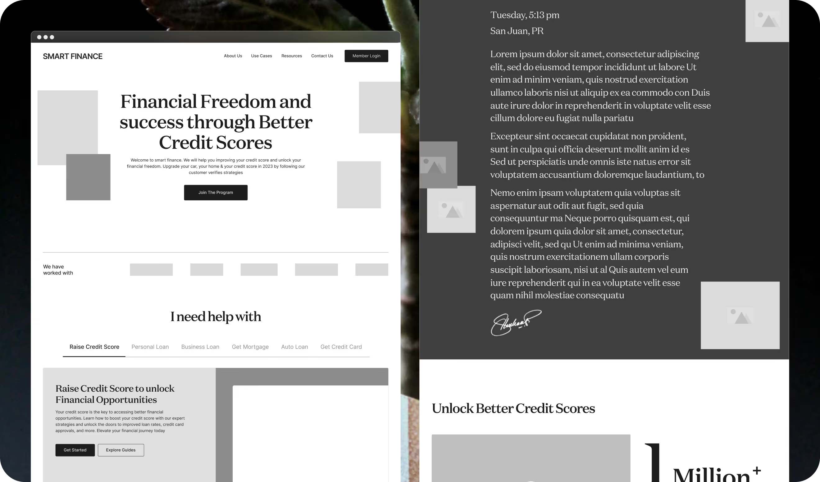
Structuring things the right way
In the wireframe phase, we focused on simplifying the layout and organizing key sections. This clear structure helped users easily navigate the design and find what they needed, making the entire process smooth and straightforward.
Redefining the Brand
After the rebranding smart finance, the platform now had a refined and cohesive look. With carefully chosen typography, colors, & streamlined layouts, the design enhances clarity & trust.
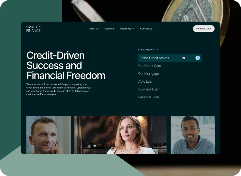
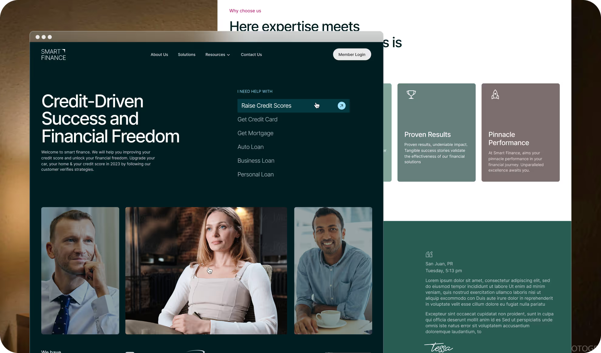
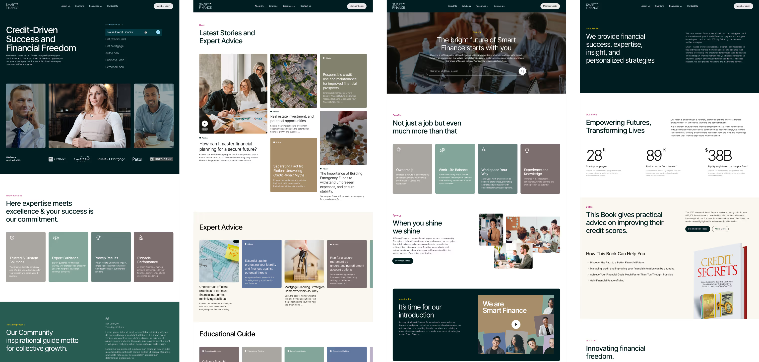
First impression matters
With intuitive navigation, clear messaging, and engaging visuals, the homepage now invites easy exploration. Users can quickly grasp what they need and how to proceed. The design blends dark colors with eye-pleasing accents, creating an inviting space that enhances usability and understanding.
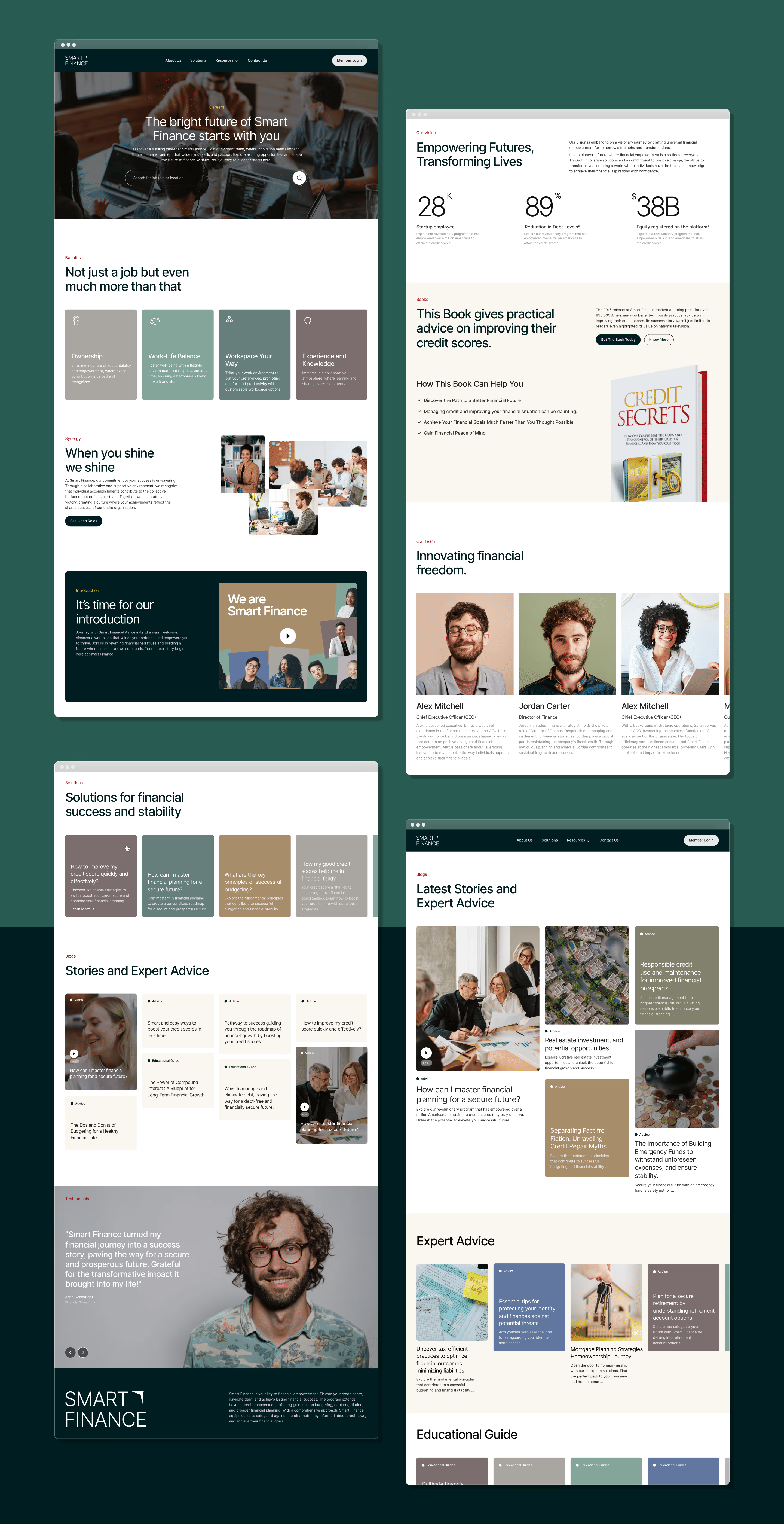
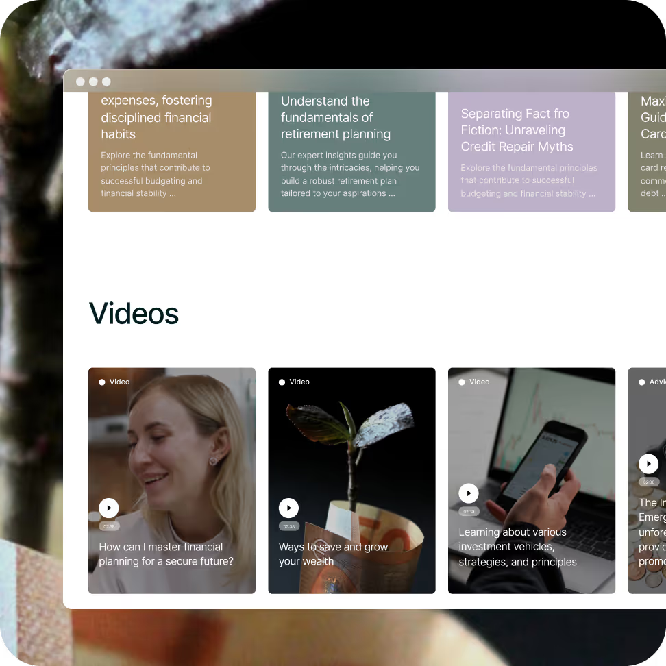
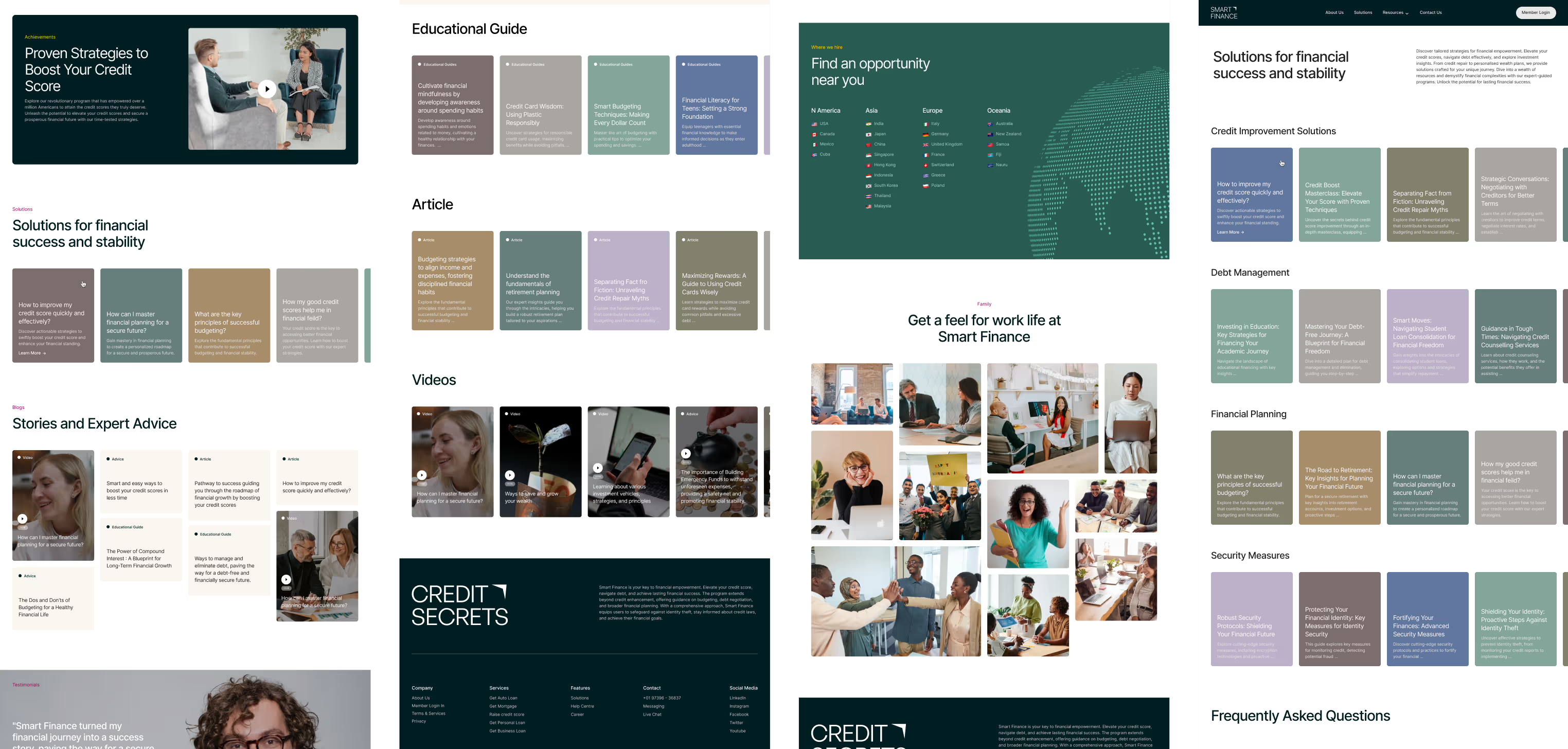
Transforming Complexity into Clear Navigation
Transformed the most complex information pages and sections into a clear and accessible experience, making it easy for users to understand, navigate, and proceed through the content.
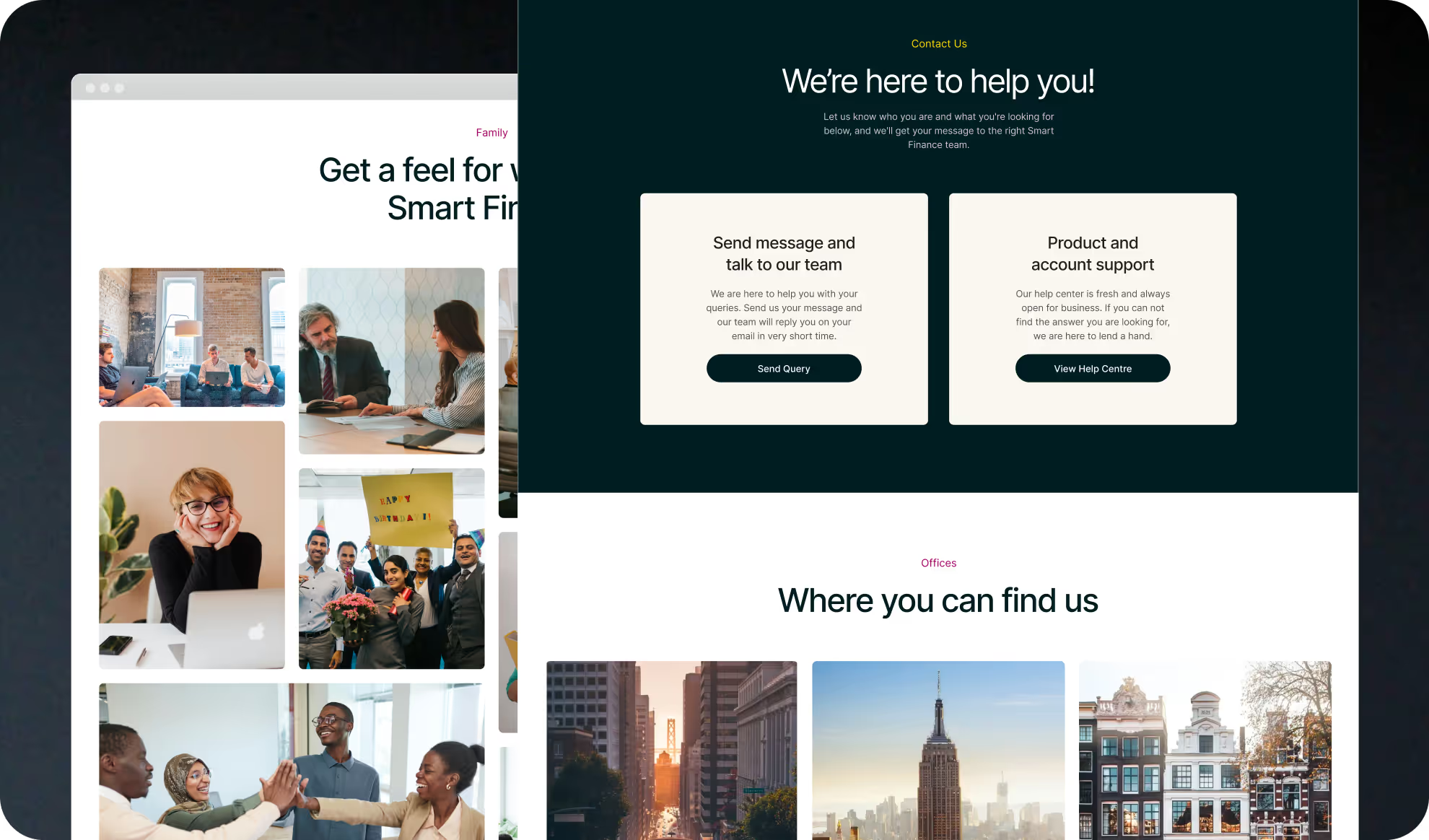
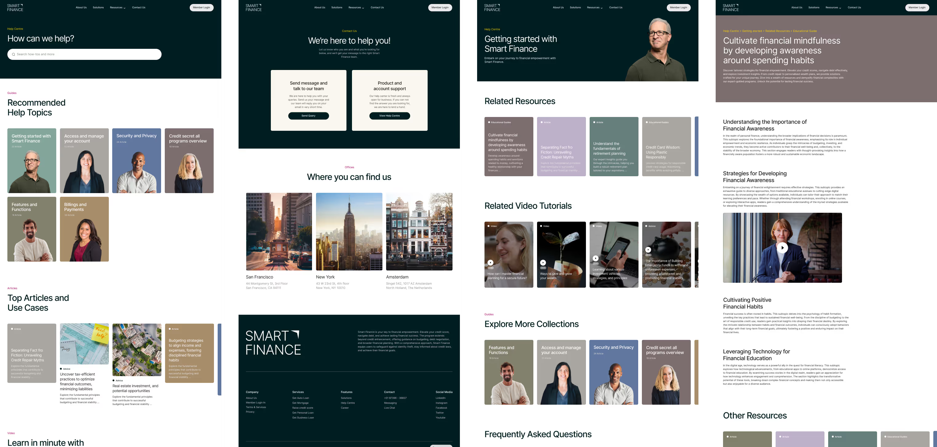
Page Enhancements
By using consistent layouts across all pages, we maintained a cohesive brand identity. This uniformity creates a familiar feel throughout the platform, making each page look and feel like part of the same family.
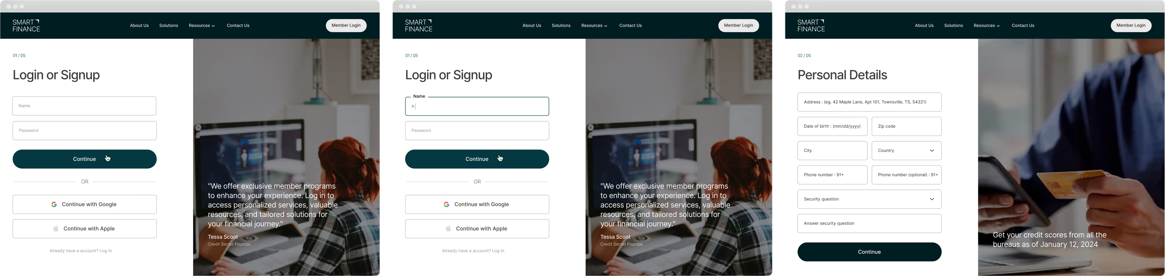
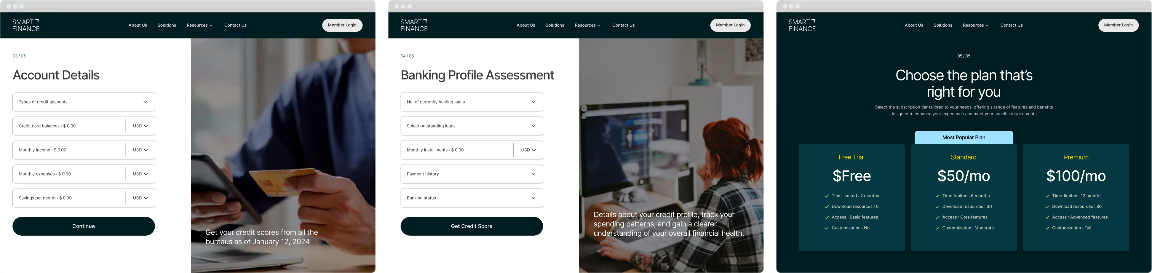
Quick and Easy Account Setup
Smart Finance enhanced its login and registration experience with a fresh UI redesign. This transformation provides an accessible, visually appealing interface that allows users to register quickly and easily, creating a seamless journey from the start.
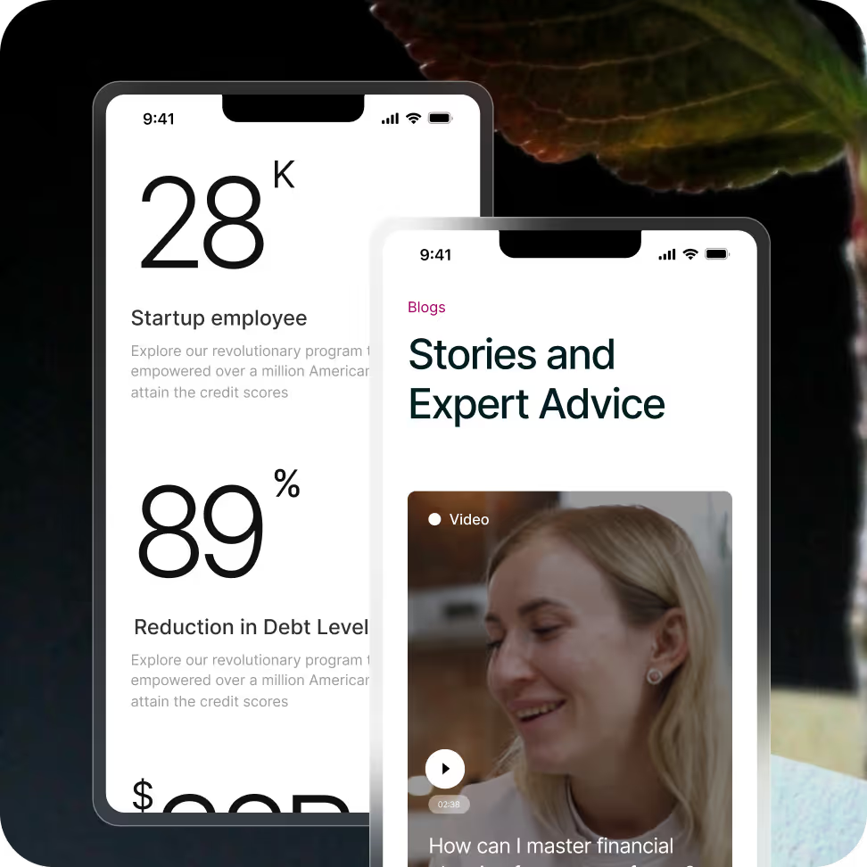
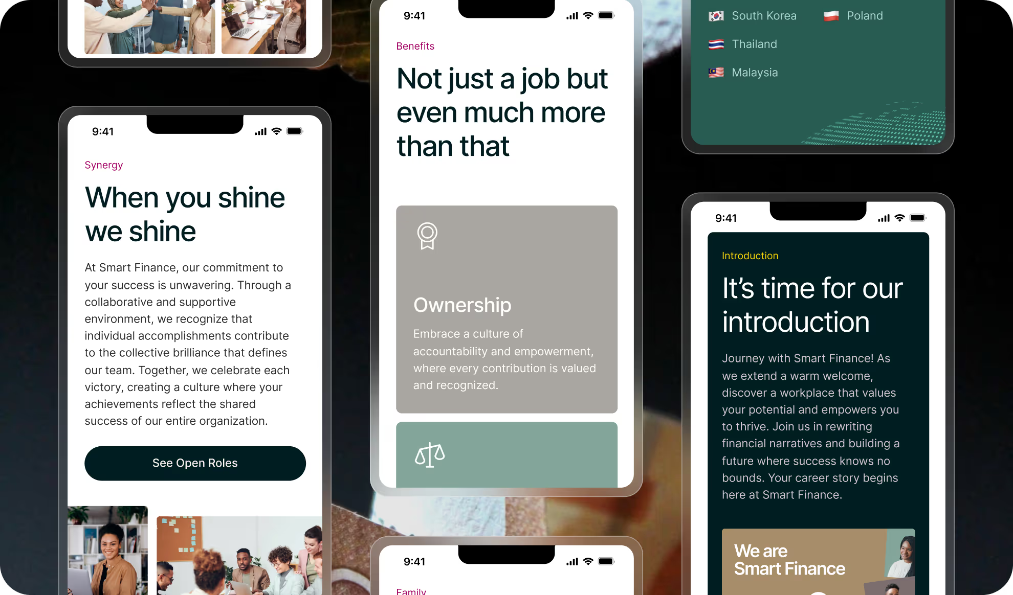
Immersion smoothly on mobile phones too
The platform is designed for mobile, offering a easy experience. Users can navigate effortlessly & manage their accounts with just few taps, ensuring convenient access to essential resources anytime, anywhere.
The Final Look ready to go!
The final product is intuitive, visually appealing, and easy to use. It simplifies financial management while maintaining a clean, modern look. A perfect blend of functionality and aesthetics, making finance effortless and engaging.