A ride-share web app that simplify travel planning by connecting users travelling on same route. It offers eco-friendly & affordable rides, making travel smarter and more flexible for daily commuters and weekend travellers alike.
Hitch aimed to streamline the ride-booking process for medium-distance trips but faced challenges with a confusing user interface and difficult navigation, leading to frustration and drop-offs.
The solution involved a complete redesign, focusing on a clean, intuitive layout that improved navigation. Clear call-to-action buttons and a simplified booking process were introduced, making it easier for users to book rides and enhancing overall user satisfaction.
Structuring things the right way
The wireframe phase simplified the layout, organized key sections, and focused on user flows, ensuring a smooth design process.
Wireframes drew inspiration from modern, user-friendly designs, emphasizing simplicity and clarity. Analyzing successful layouts helped structure key elements for a smooth user flow.
Testing and refinement aligned the wireframes with the user journey, creating a solid foundation for an intuitive experience.
Redefining the Brand
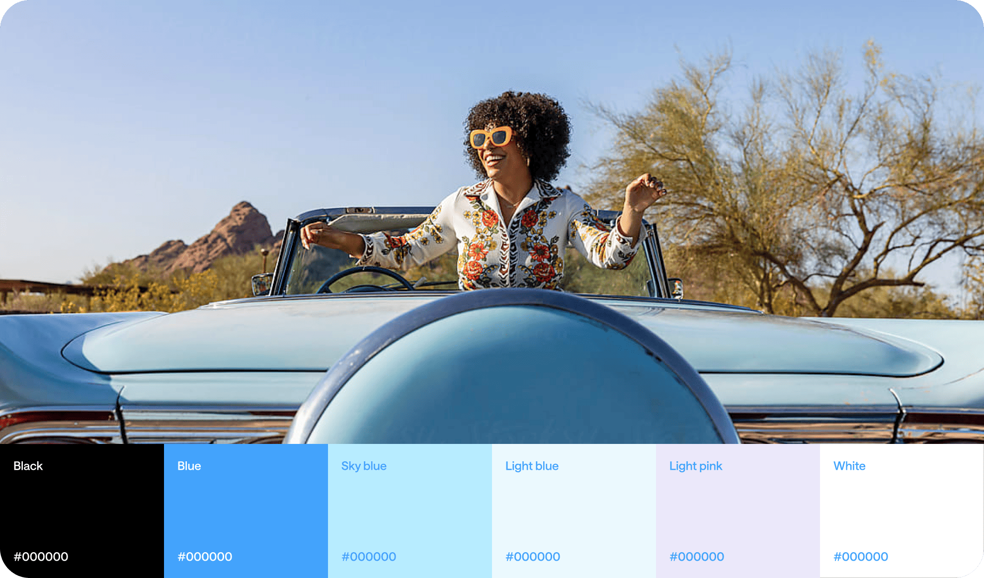
Branding gave platform a refined & cohesive look. With carefully chosen typography, colors, and streamlined layouts, the design enhances clarity and trust.
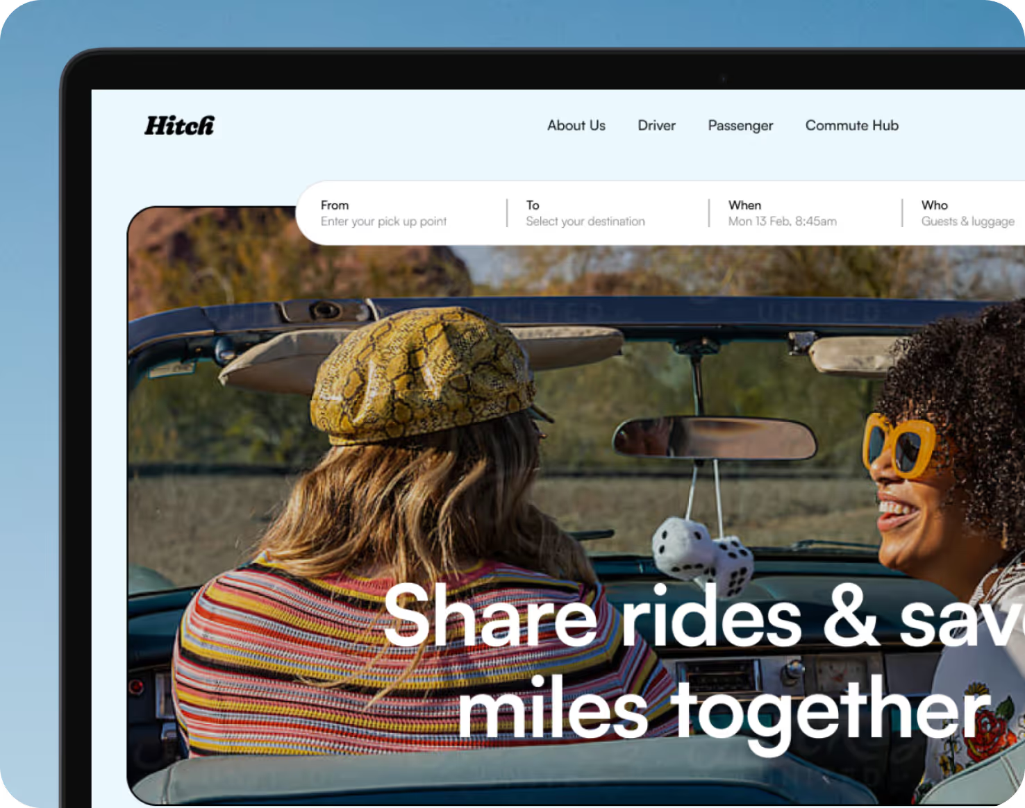
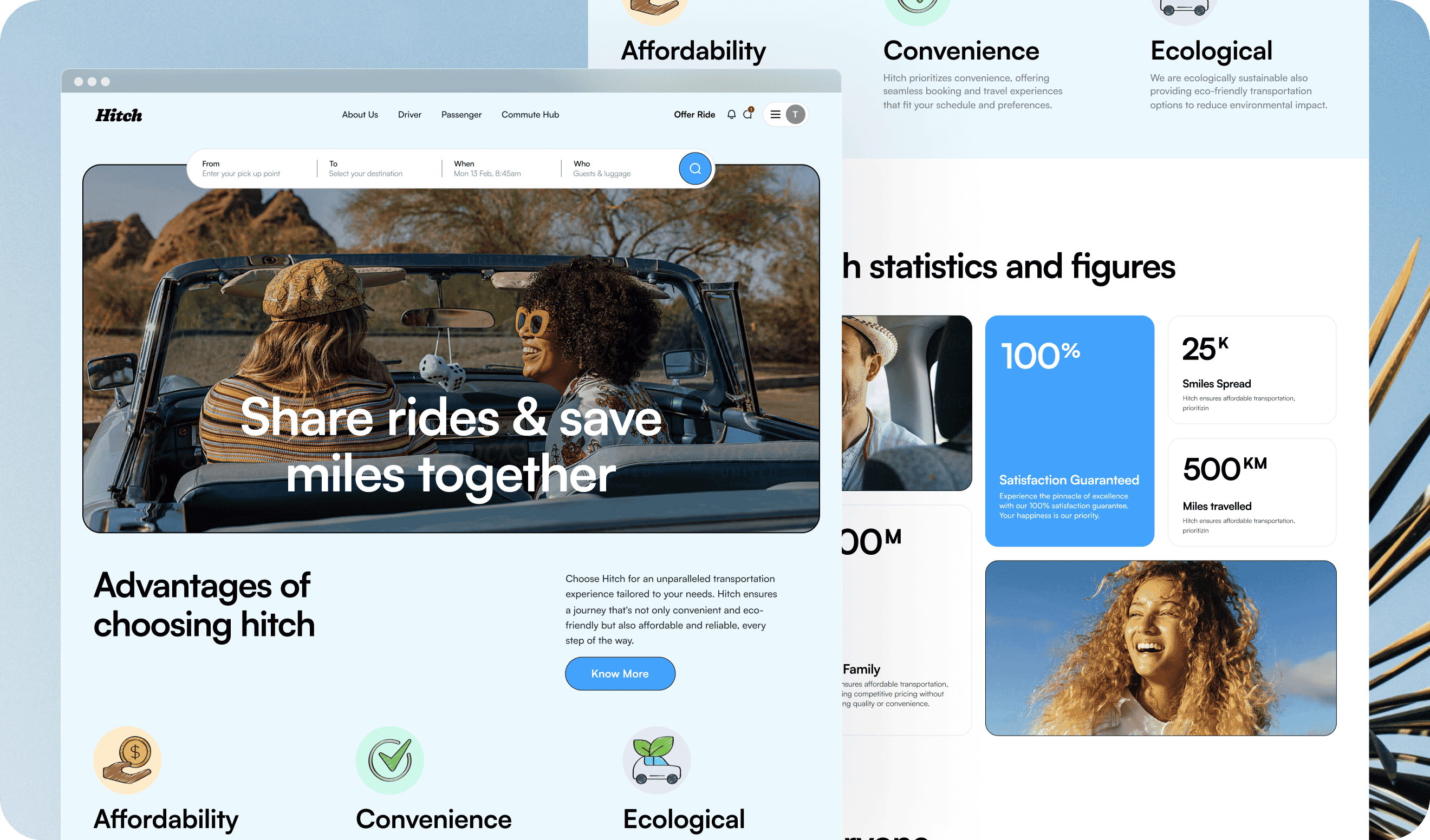
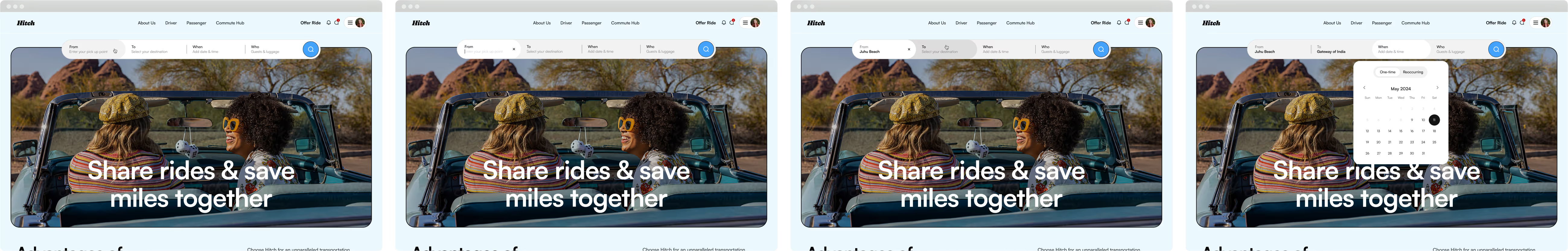
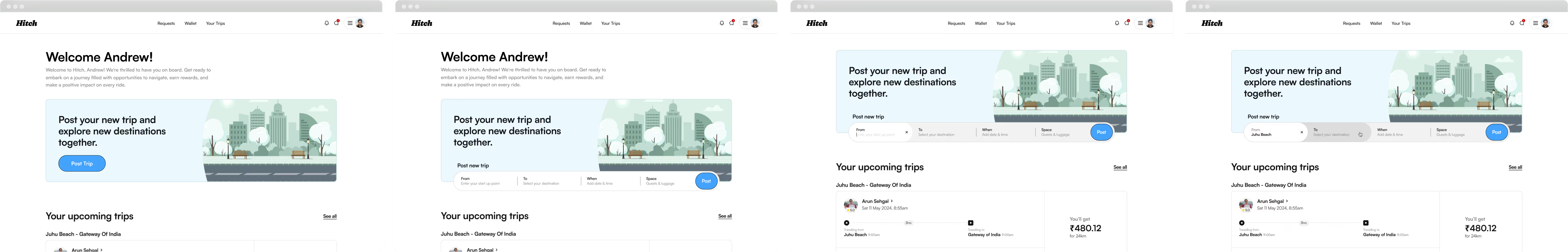
The First impression
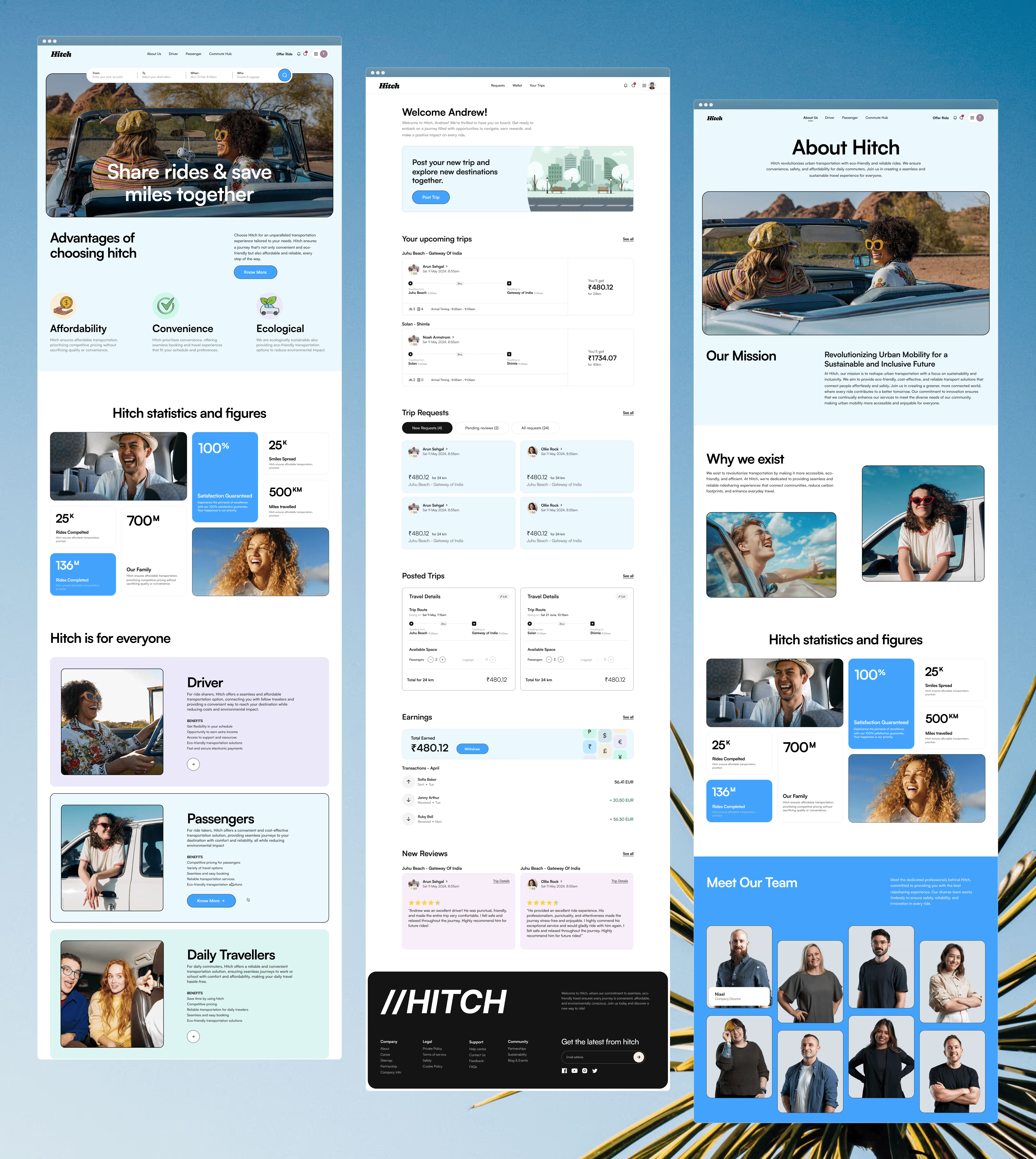
The home page was designed after in-depth research and inspiration, focusing on simplicity and ease. It ensures an effortless user experience with a clean layout and intuitive navigation.
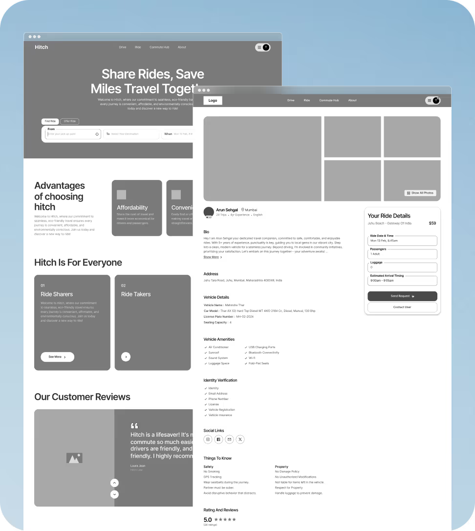
Page Enhancements
Other pages were enhanced by following a clean, structured layout with clear navigation. This approach maintained consistency across the platform, ensuring ease of use and improving overall user engagement.
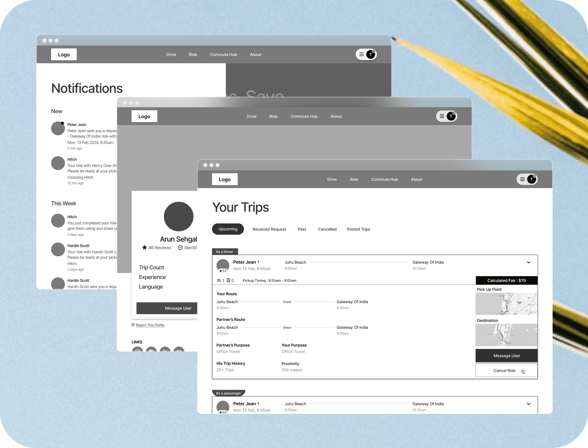
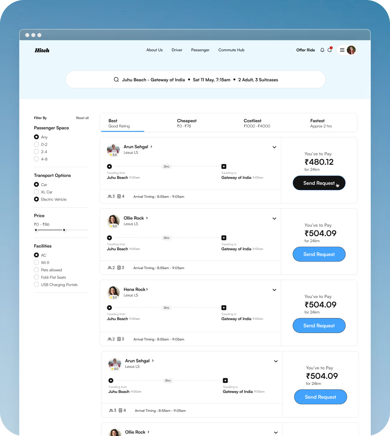
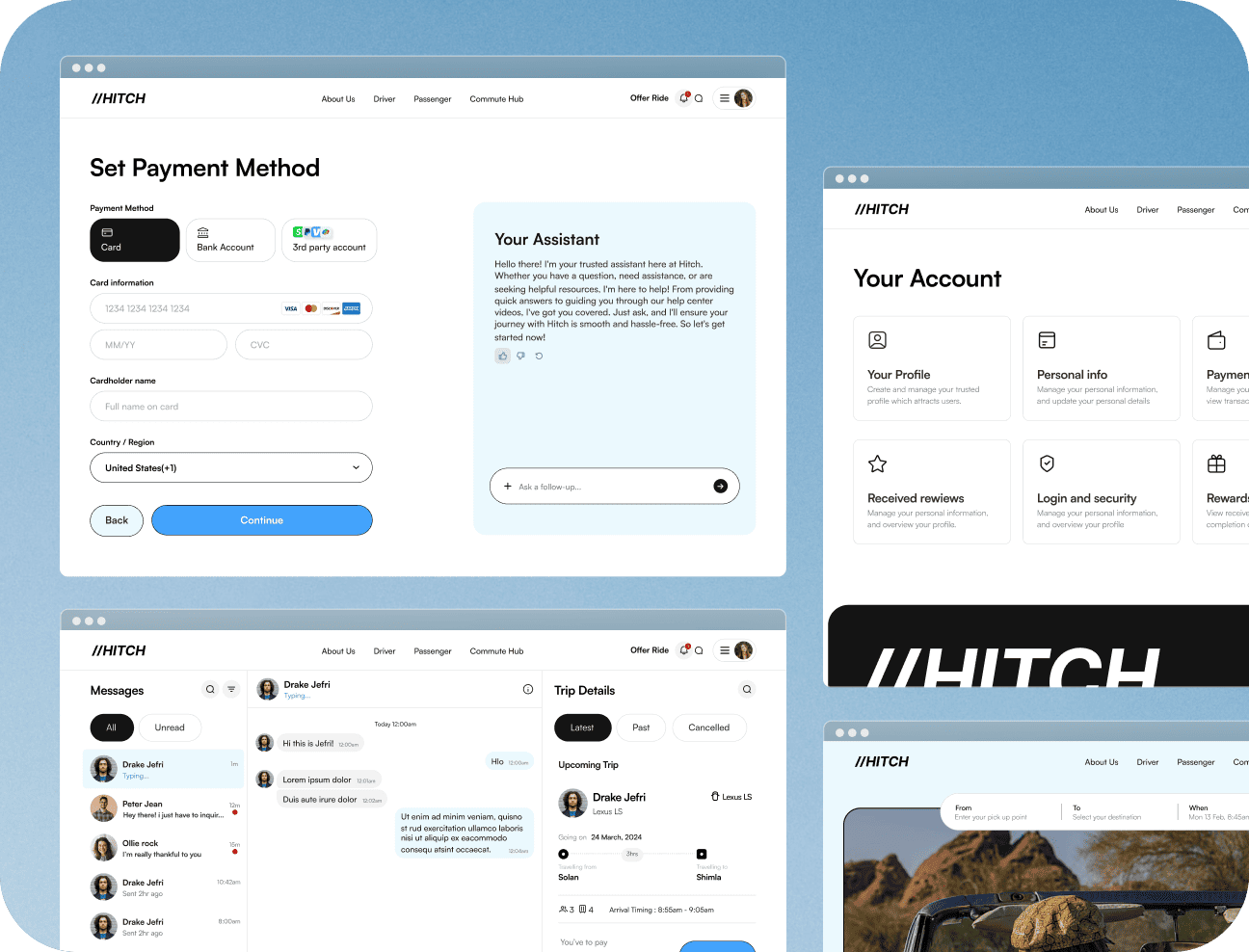
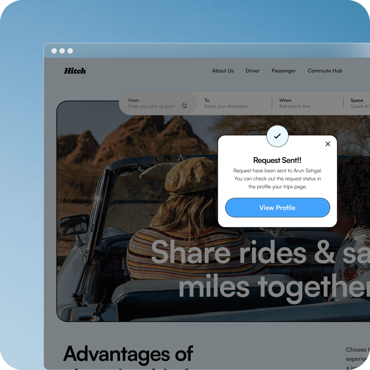
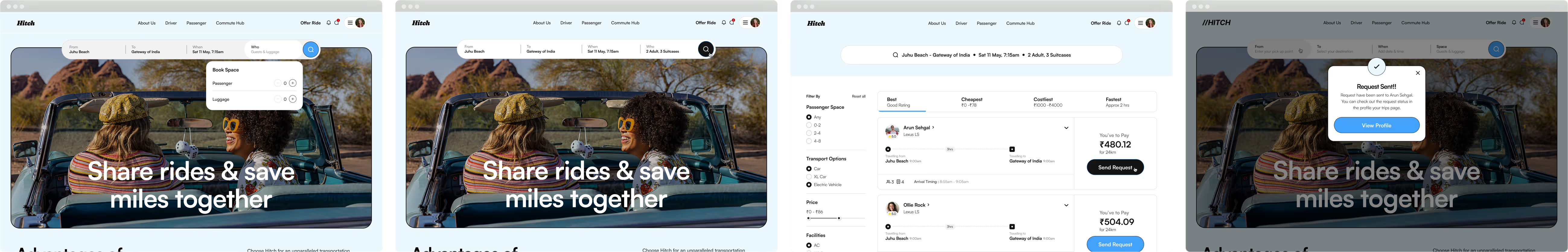
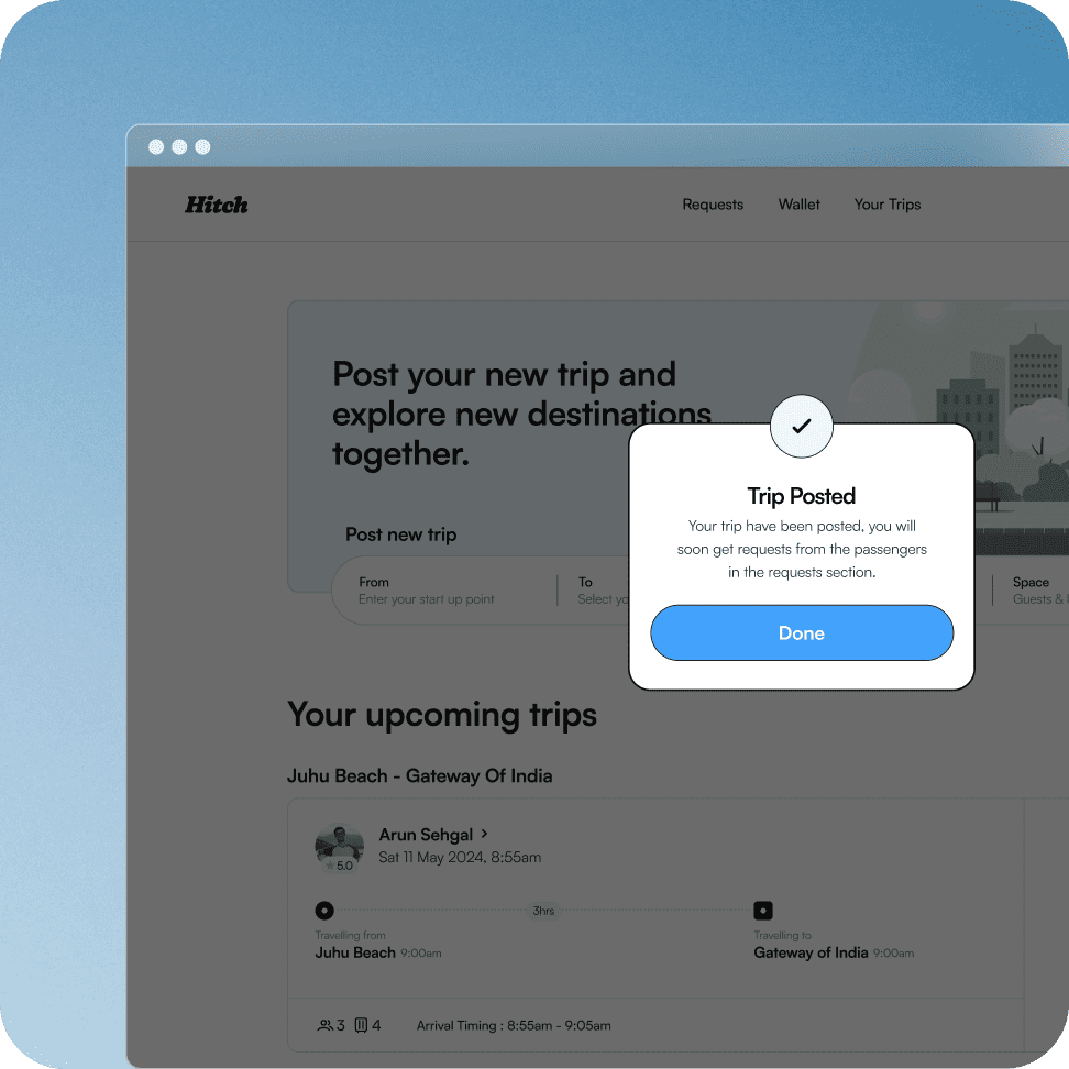
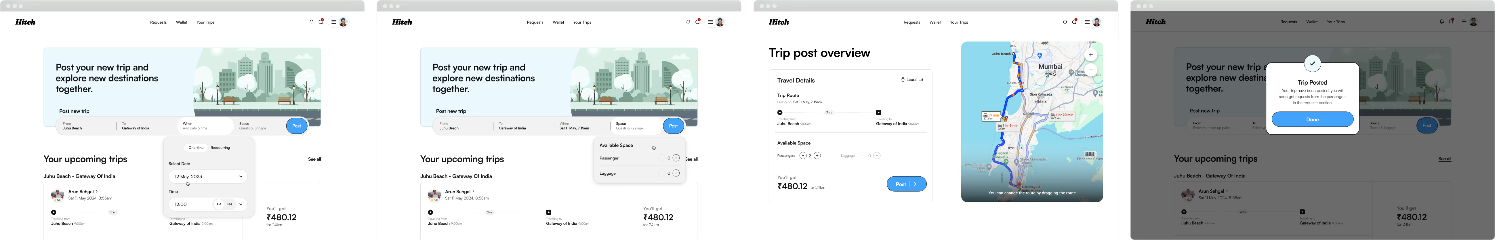
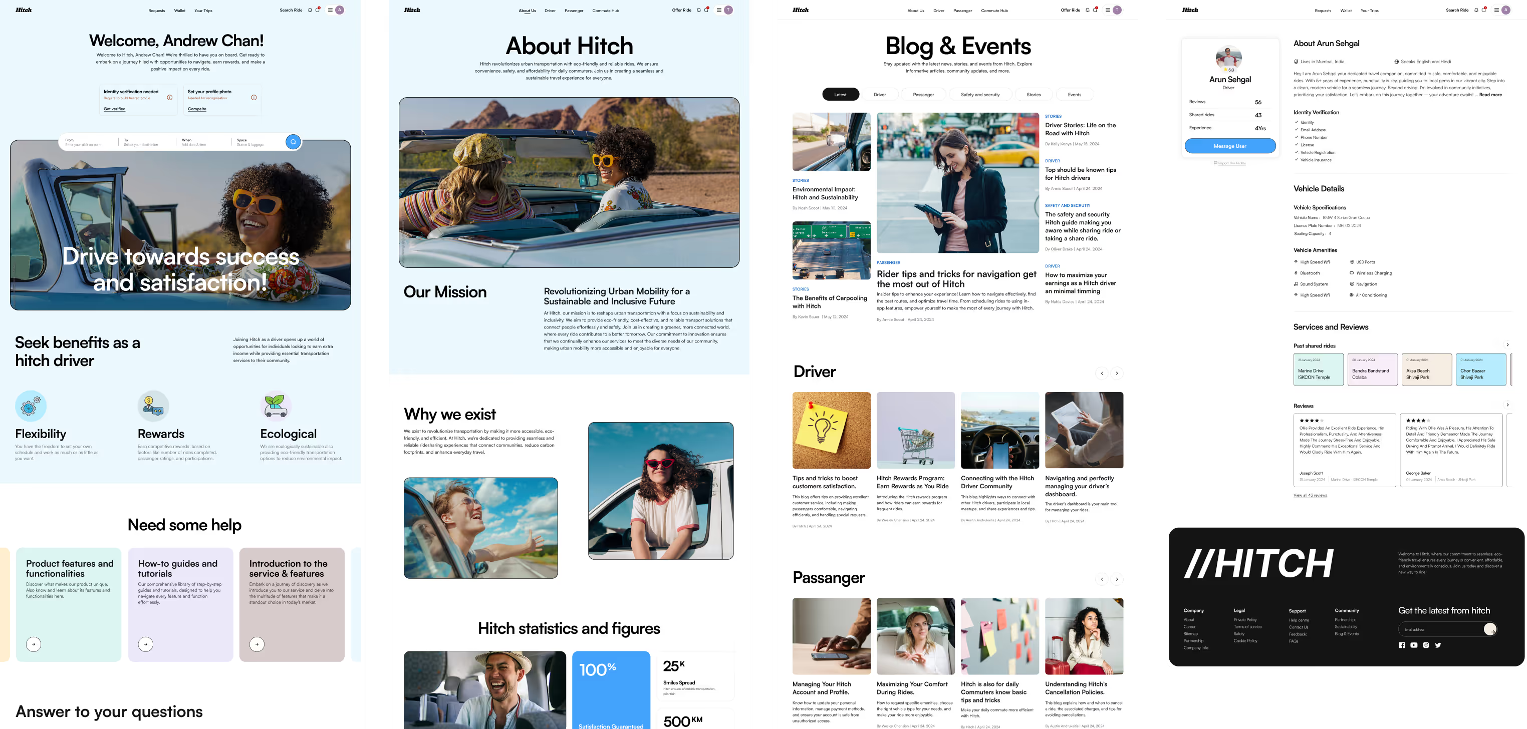
Seamless Experiences for Passengers
Designing a stress-free journey where passengers feel confident, in control, and enjoy an effortless ride experience from booking to arrival, with every step made simple and easy.
The passenger pages for Hitch were crafted with one goal in mind—ease of use. Every element was designed to make booking a ride as simple and stress-free as possible. From searching for a driver to tracking the ride, the user flow was intuitive and clear.
Through thoughtful design, personalized features, and minimal steps, passengers could focus on their journey while feeling in control at every touchpoint. The aim was to create a smooth, enjoyable experience that passengers could rely on every time.
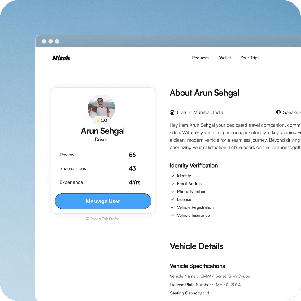
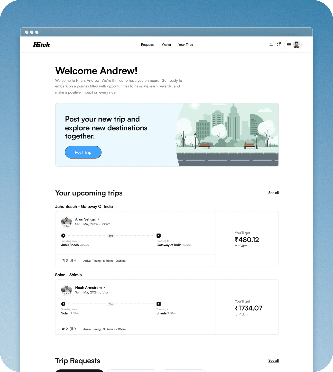
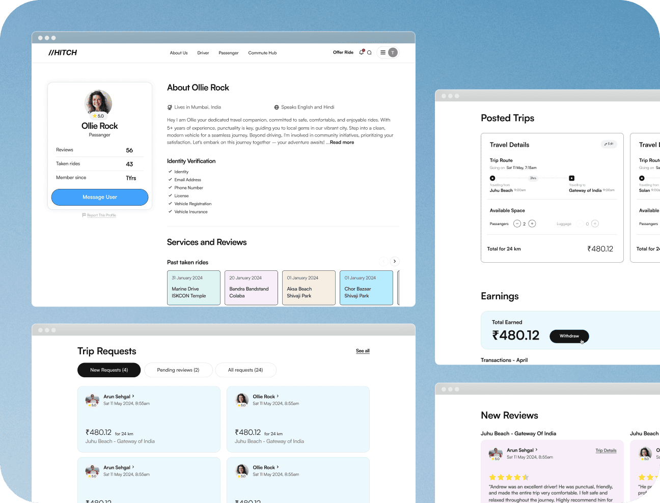
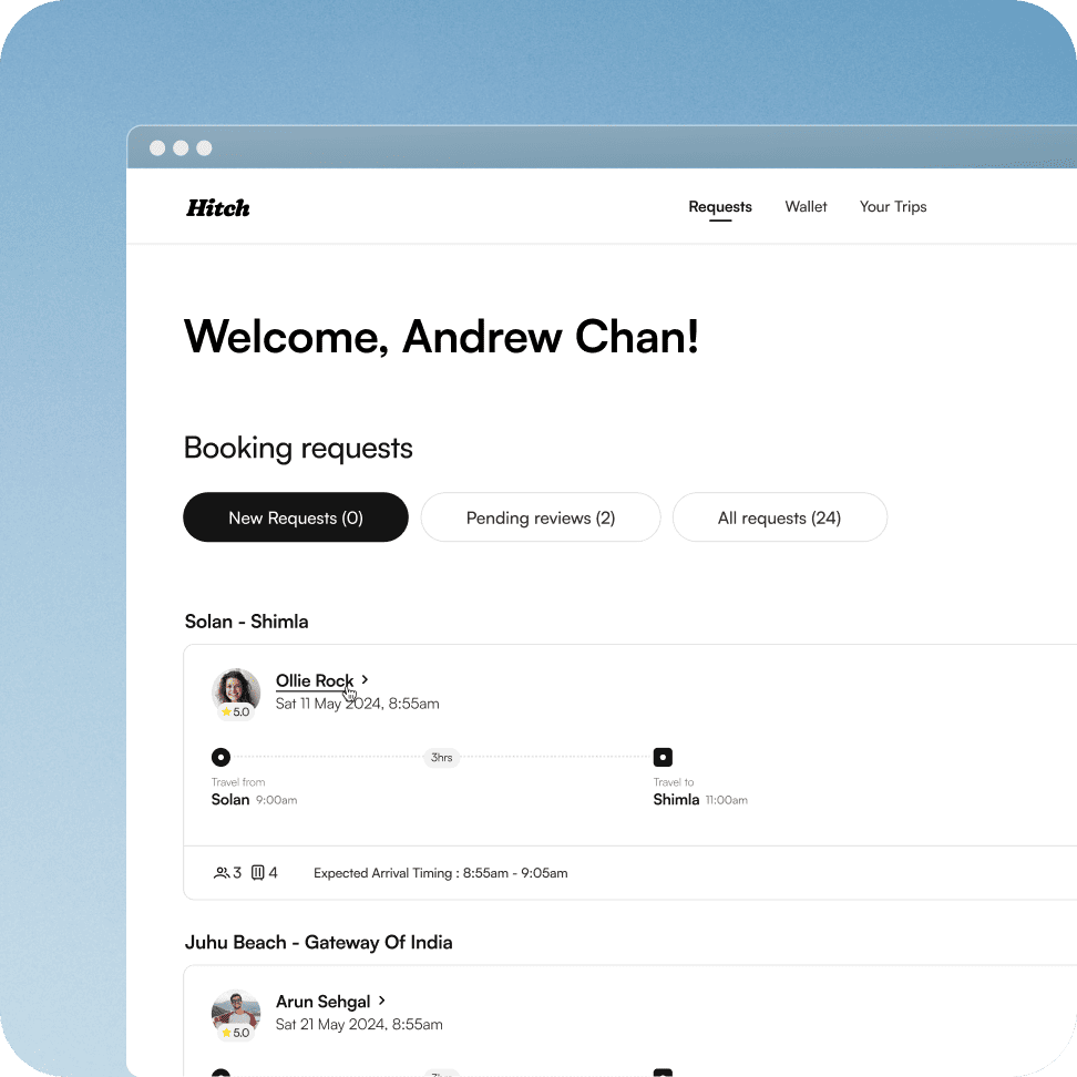
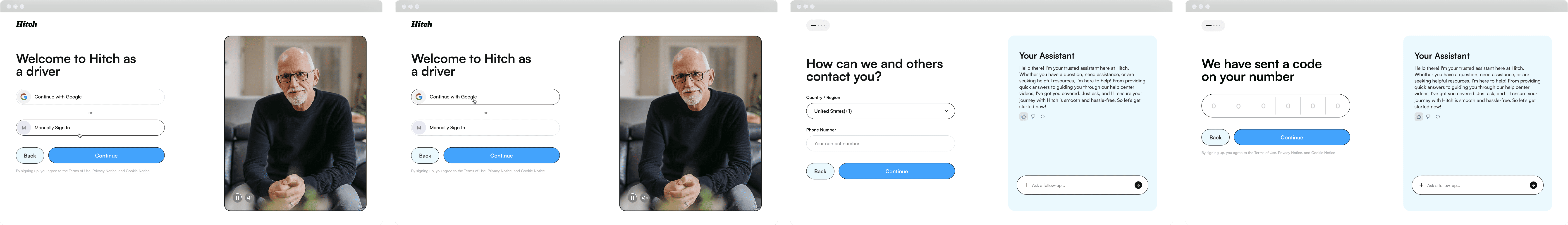
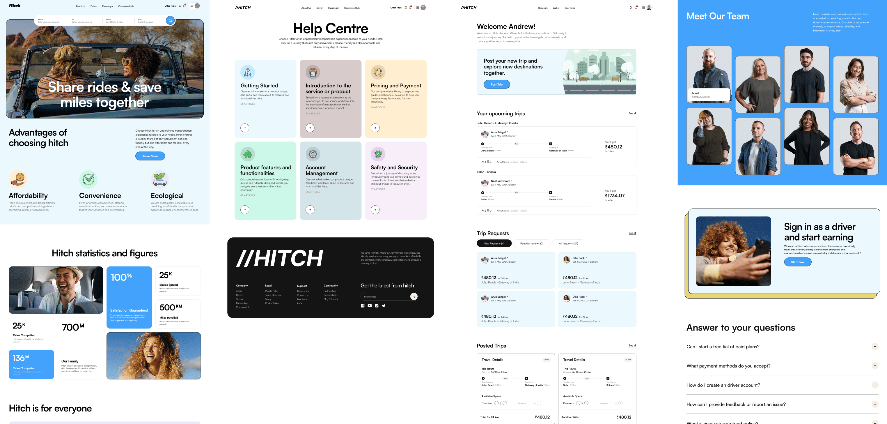
Designing an Effortless Experience for Drivers
Making the driver’s journey effortless – from accepting rides-to-navigate the platform to accept, manage, complete rides and earning eco friendly with ease without any distractions.
The driver’s pages for Hitch were created to make their experience as smooth and easy as possible. Every screen was thoughtfully laid out to streamline the flow, from accepting ride offers to navigating their trips.
By reducing complexity and focusing on key actions, drivers could focus on what matters—offering great rides. Features like real-time notifications and clear routes helped make the driving process feel simple and rewarding.
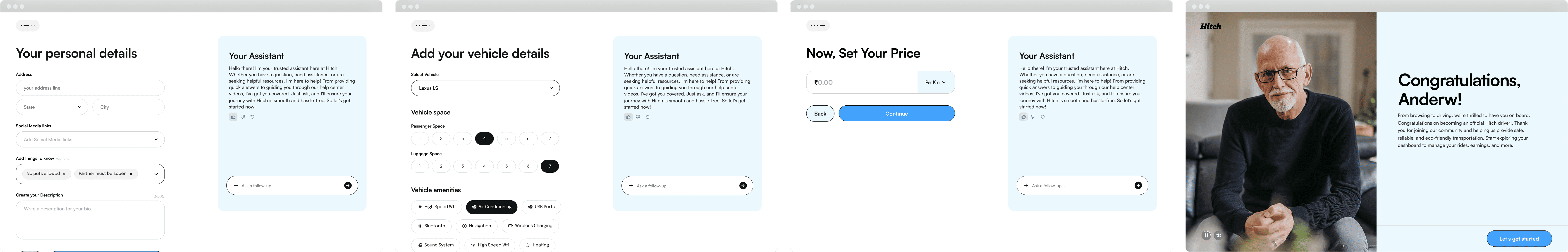
Registration Process
The registration process was streamlined to ensure a quick and hassle-free experience for users. Simple forms and clear prompts guide users effortlessly from sign-up to start using the app.
Project End
The project culminated in a user-friendly platform that enhances the travel experience, making rideshare options accessible and straightforward. With a clean design and intuitive navigation, Hitch empowers users to connect and travel with ease.